
- AI
- A
AI website generator on ChatGPT and Next.js 15: Creating SEO‑optimized pages from scratch
Imagine a design agency that creates not just beautiful layouts, but entire technological ecosystems. By investing once in the development of unique components and a brand identity, designers gain the ability to generate professional websites at a speed of 50+ projects per hour. In practice, this comes down to a simple cycle: you send a prompt to ChatGPT, receive a configuration file in response, upload it to the application, and with a single build command create ready‑made, styled pages. All of this is already set up in the starter template, including authentication and a multilingual AI chat.
This tutorial is the first part of a large journey, in which we will create an AI system for automatically generating web pages with React 19 and Next.js 15. Our goal is not just speed, but architectural elegance and perfect design consistency.
The plan is as follows:
Part 1 (You are here): Analyzing the basic architecture: "greedy" routes, transformer component, and typed configs for standard pages.
Part 2: Complicating the task: generating documentation pages and interactive tutorials.
Part 3: Adding intelligence: configuring AI for autonomous content generation.
Bonus: Practical case — deploying, monetizing, and scaling a real application.
This is a step-by-step guide to creating your own v0-level corporate analog with registrations and payments. A real business on generating beautiful applications with a revolutionary interface from A to Z, in the final fourth publication. To build the whole system, subscribe. It will only get more interesting from here.
As always, I provide the source code of the finished solution so that you can immediately start creating blogs, stores, landing pages, etc. https://github.com/aifa-agi/aifa
Project tech stack: React 19, Next.js 15, Vercel, Prisma, Stripe, AI SDK, Chat GPT
The tech stack combines stability and advanced capabilities: React 19 and Next.js 15 with App Router provide lightning-fast rendering and parallel routes, Vercel guarantees zero-downtime deployments, and Prisma and Neon offer type-safe data access. Stripe integrates instant payments, AI SDK with ChatGPT adds an intelligent layer, allowing AIFA Dev Starter to generate interfaces, content, and prototypes in just minutes, already including authorization and multilingual AI chat.
In practice, it boils down to a simple cycle: you send a prompt to ChatGPT, receive a configuration file in response, upload it to the app, and with a single build command, create ready, styled pages. All of this is already set up in the starter template, including authorization and multilingual AI chat.
Or use full automation just like in v0, but with a focus on large corporate integrations. (In the updated https://aifa.dev after the third publication)
Here’s an example:
Who benefits from an AI website generation system: studios, corporations, startups, freelancers
New format design studios: from mockup to mass site launch in minutes
Imagine a design agency that creates not just beautiful mockups, but entire technological ecosystems. Once invested in the development of unique components and brand style, designers can generate professional websites at a rate of 50+ projects per hour.
This is not science fiction — it's a new business model where creativity meets automation. And yes, monetization is already built-in via Stripe — I'll talk about this in the upcoming parts!
Corporate implementations: unified style and scalability for enterprise sites
The classic case is a QR menu for a restaurant chain. Once a professional dish card system is created, the business owner can offer a ready-made solution to hundreds of establishments. Restaurants only adapt the colors to their brand and fill the content with their voice—while the professional design and UX remain unchanged.
Scalability, uniformity, and speed of implementation are exactly what the corporate segment needs in 2025.
Transformer architecture of components: JSON → React without manual layout
The AIFA Dev technology is based on two critically important components:
1. Intelligent prompt engineering
Specially trained instructions for AI that can extract precise examples of sections from vector databases and adapt them for specific tasks.
2. Transformer component architecture
React components that "understand" configuration files and turn JSON descriptions into live, interactive pages.
External models (ChatGPT, Claude) are excellent at generating content, but unpacking components are the heart of the system, which we build ourselves.
AI-ready documentation: how to use text as a knowledge base for ChatGPT
Don't read this tutorial—use it as an AI assistant!
The main value of this extensive material lies not in sequential reading, but in its ability to become a personal knowledge base for your projects.
How it works:
Copy the entire text into ChatGPT
Ask specific questions: "How to implement...?", "Why do we need...?", "Show me the code for..."
Get precise answers with ready-made components
This is not documentation for reading—it’s an interactive guide for quickly solving tasks. Try this approach, and you'll understand why modern technical documentation should be AI-ready!
1. Introduction: purpose, benefits, and the method's place among v0-generation generators
This tutorial does not aim to create a solution that outperforms v0 in terms of generation speed. The main goal is to ensure uniformity and harmony in the design across all pages of the project.
Yes, creating each individual page might take slightly more time compared to universal generators. However, the overall project costs are significantly reduced thanks to the following benefits:
Unified style of all components—each new page automatically fits into the overall design system
Harmony throughout the project—no stylistic breaks between different sections of the site
Reduced revision costs—minimal need for subsequent styling and adaptation
Scalability of the solution—the more pages, the higher the effectiveness of the approach
Result: the project looks visually cohesive, professional, and requires minimal effort to maintain consistency when scaling.
The main tutorial covers the creation of standard pages using basic header and footer components.
However, in the project’s source code, you will find custom implementations for specialized types of pages:
Documentation pages with extended navigation
Tutorial pages with interactive elements
Working with complex components:
Note that some components on the main page have more complex logic:
State management
Animations and transitions
Interactive elements
Integration of advanced solutions:
To integrate such complex components, there is the option to add custom components instead of standard sections. This allows you to:
Maintain system flexibility
Implement unique functionality
Maintain a consistent style even for non-standard solutions
Practical task:
Studying the process of creating and integrating custom components remains your practical task for consolidating acquired knowledge.
1.1. Concept: uniform brand pages created by AI from templates
The modern development process requires speed, interface consistency, and the ability to quickly respond to business requirements. We offer an architecture in which standard, formalized descriptions of design sections (Hero, CTA, FAQ, Features, etc.) are stored in a structured AI knowledge base.
By uploading your current UI/UX standards for each section there, you allow artificial intelligence to act not only as a content generator but also as a guarantor of a consistent brand style at all levels of page creation.
1.2. Five stages: from uploading design templates to SEO-optimized build
Uploading design standards:
Templates and instructions for each section are added to the AI knowledge base—how to visually and structurally implement them within the unified style of your brand.Processing a text request:
A user, project manager, or programmer creates a task in the form of a text prompt—describing the desired page or its elements.AI interpretation and structuring:
The AI analyzes the request, generates semantic content, breaks it into logical sections, and selects suitable templates from the knowledge base.Page code generation:
Based on the selected templates and generated content, the system creates strict PageConfigs—declarative JSON/Type descriptions of future pages. They ensure adherence to all design standards and simplify downstream development.Automatic assembly and building:
The ready configurations are used for static page generation with render components, resulting in a complete, SEO-optimized page that meets your corporate standards visually and technically.
1.3. Resource savings and conversion growth: business benefits of AI generation
Fast rollout of new landing pages and product pages—just a prompt is enough for the AI to generate a page based on current templates.
Consistent brand style and quality—automatically extracted and maintained for every new page.
Minimizing manual work and enabling A/B testing—scaling page variants and changing content via AI without developer involvement in layout.
Preparedness for multilingual support—all texts and elements are stored centrally, easily localized and adapted.
Infrastructure flexibility—easily integrates into CI/CD pipelines, modern hosting and AI-driven processes.
1.4. How to continue: a roadmap of three articles and a bonus case
In this tutorial, we will go through step-by-step:
Architecture of existing components — a detailed breakdown of the PageHtmlTransformer structure, the wrapper system (Wrapper/FullScreenWrapper), section components, and their interaction to understand the internal mechanisms of operation.
System operation principles — studying the logic of section rendering, configuration typing, routing mechanisms, and the link between configuration files and React components. This is necessary so that developers can independently extend these representations.
Creating instructions for artificial intelligence — forming a structured description of currently available types for metadata, header section, footer section. Adding requirements for creating a JSX fragment for the body section with detailed specifications and constraints.
Generating configuration files — practical application of the knowledge gained to create config files that will be used by AI for automatic page generation in compliance with all architectural principles and design standards.
2. Project structure: folders, files, and Next.js 15 routing logic
Tree
app/@right/
├── public/
│   ├── (_routing)/
│   │   └── /
│   │       └── page.tsx                          # 1. Dynamic routing
│   └── (_service)/
│       ├── (_config)/
│       │   └── public-pages-config.ts   # 6. Public pages configuration
│       └── (_libs)/
│           └── utils.ts                                        # 7. Utilities
└── (_service)/
    ├── (_types)
    │   ├── /page-transformer-custom-types/
    │   └── page-wrapper-types.ts                     # 5. Types and interfaces
    └── (_components)/
        └── page-transformer-components/
            ├── page-html-transformer.tsx           # 2. Main transformer
	    ├──  custom-sections/
            ├── wrappers/
            │   ├── full-screen-wrapper.tsx      # 3. Full-screen wrapper
            │   └── wrapper.tsx                    # 4. Standard wrapper
            ├── header-sections-components/
            │   ├── header-section.tsx             # 8. Header component
            │   ├── page-header-elements.tsx        # 9. Header elements
            │   └── announcement.tsx                # 10. Announcement component
	    ├── body-sections-components/
            │   └── body-section.tsx                   # 12. Body component
            └── footer-sections-components/
                └── footer-section.tsx               # 11. Footer component
Components:
1-@/app/@right/public/(_routing)//page.tsx
2-@/app/@right/(_service)/(_components)/page-transformer-components/page-html-transformer.tsx
3-@/app/@right/(_service)/(_components)/page-transformer-components/wrappers/full-screen-wrapper.tsx
4-app/@right/(_service)/(_components)/page-transformer-components/wrappers/wrapper.tsx
5-app/@right/(_service)/(_types)/page-wrapper-types.ts
6-// @/app/@right/public/(_servise)/(_config)/public-pages-config.ts
7-//@app/@right/public/(_servise)/(_libs)/utils.ts
8-@/app/@right/(_service)/(_components)/page-transformer-components/header-sections-components/header-section.tsx
9-@app/@right/(_service)/(_components)/page-transformer-components/header-sections-components/page-header-elements.tsx
10-@app/@right/(_service)/(_components)/page-transformer-components/header-sections-components/announcement.tsx
11-@app/@right/(_service)/(_components)/page-transformer-components/footer-sections-components/footer-section.tsx
12-@app/@right/(_service)/(_components)/page-transformer-components/body-sections-components/body-section.tsx
2.1. Basic set of components: out-of-the-box template page rendering
Purpose
Standard components represent a basic set of elements for creating typed pages in a unified style. This collection includes architecture-defining elements: dynamic routing, central transformer, wrappers for different types of content, unified header and footer sections, as well as configuration files and typing.
Key principles of standard components:
Interface consistency — all components follow common design and behavior principles
AI compatibility — structure optimized for automatic content generation
SEO optimization — built-in support for search optimization and proper HTML semantics
Typed architecture — strict typing via TypeScript for predictable behavior
Modularity — each component solves a specific task and can be used independently
These components form the foundation of the system, ensuring visual consistency and technical uniformity of all AI-generated pages.
2.1.1. Component /page.tsx: universal catch-all route for dynamic URLs
2.1.1.1. Why Next.js uses catch-all routes: flexibility, fast deployment
A greedy route (catch-all route) is a type of dynamic route in Next.js that allows processing an unlimited number of nested URL segments using a single page component. In the construction [...slug] or (optional) slug array in parameters, all parts of the path will be contained regardless of their number.
Why this is cool:
Arbitrary number of nesting levels.
You don’t need to create separate folders and files in the project structure for every new path. For example, the path /public/category/nike/sneakers/black/12345 will be processed by exactly the same component as /public/test.Flexible navigation and fast launch of new pages.
Just add the appropriate config — and the page instantly appears in the application without creating new components or maintaining a complex file structure.Automation:
This setup perfectly matches auto-generated sidebar/menu: create the necessary item in navigation and the “smart” routing automatically handles displaying the required page.
2.1.1.2. The value of dynamic URLs for AI assistants: infinite content expansion
In modern SaaS/AI products or headless sites there is often a need to quickly create new pages “on the fly” at the request of a user or administrator — the page is built and configured not manually, but through generation (AI or admin panel).
Architecture with a greedy route:
Removes limitations on structure and nesting depth of pages,
Allows working with any number of hierarchy levels (for example, restaurant menus with multi-level categorization; product cards in the structure catalog/category/manufacturer/line/item code),
Provides freedom for users and developers — navigation is built solely on project logic and is not tied to the file structure.
2.1.1.3. Usage examples:
QR-menu for the restaurant:
/public/menu/bar/beer and /public/menu/hot-dishes/italian/pasta → any depth of subcategories.Online store:
/public/shop/clothes/mens/jackets/leather/2023/black/style123Educational portal:
/public/tutorials/python/basics/loops/while-loop/example1
2.1.1.4. How the component page.tsx works
Main tasks:
An array of slugs comes from the URL (for example, ["category", "nike", "sneakers"]).
The function generateStaticParams collects all the routes present in your config (pages-config.ts) and passes them to Next.js for static generation.
The function getPageBySlug quickly finds the required page in the config array by the exact slug received (usually with "public" added at the beginning).
export async function generateStaticParams() {

  const pages: PageConfig[] = getAllPublicPages();

  return pages.map((page: PageConfig) => ({

    slug: page.metadata.slug ? page.metadata.slug.slice(1) : [],

  }));

}
Here we form all possible paths for static generation: if the config contains ["public","cat","subcat","product"], the path /public/cat/subcat/product will be generated.
Then, when rendering happens:
export default async function PublicDynamicSlugPage({ params }: Props) {
const resolvedParams = await params;
const slugArr = resolvedParams.slug ?? [];
const pageConfig = getPageBySlug(["public", ...slugArr]);
if (!pageConfig) {
return Page not found;
}
return slugArr can be of any length!
"public" is added for correct searching in the array.
The search function works by exact slug match, which excludes collisions.
h5 2.1.1.5. Briefly about key functions:
generateStaticParams — tells Next.js ALL existing nested paths for generation.
getPageBySlug — searches for the required page in the array by exact match of the slug array.
PageHtmlTransformer — a universal renderer that doesn't care about the depth of the page's nesting: it builds the component on the fly from your formalized config.
2.1.1.6. Conclusion. Why this approach was chosen
Flexibility for new sections: no need to think about folders — just add a config and the page will appear!
Convenience of editing and scaling navigation: all routing and navigation are controlled at the data level (slug arrays), not by files.
Real business scenarios: automation of menu, product, course, documentation, blog generation, and anything else that might come to mind.
Standardization for AI assistants: this approach is perfectly suited for automatic content generation based on a text description (prompt) — any new pages appear instantly and are not limited by the route depth.
2.1.1.7. Component
// @/app/@right/public/(_routing)//page.tsx
import { PageHtmlTransformer } from "@/app/@right/(_service)/(_components)/page-transformer-components/page-html-transformer";
import { getPageBySlug } from "@/app/@right/(_service)/(_config)/pages-config";
import { constructMetadata } from "@/lib/construct-metadata";
import type { PageConfig } from "@/app/@right/(_service)/(_types)/page-wrapper-types";
import { getAllPublicPages } from "../../(_servise)/(_libs)/get-all-public-pages";
interface Props {
params: Promise<{ slug?: string[] }>;
}
export async function generateStaticParams() {
const pages: PageConfig[] = getAllPublicPages();
return pages.map((page: PageConfig) => ({
slug: page.metadata.slug || [],
}));
}
export async function generateMetadata({ params }: Props) {
const resolvedParams = await params;
const slugArr = resolvedParams.slug ?? [];
const pageConfig = getPageBySlug(["public", ...slugArr]);
if (!pageConfig) return {};
return constructMetadata(pageConfig.metadata);
}
export default async function PublicDynamicSlugPage({ params }: Props) {
const resolvedParams = await params;
const slugArr = resolvedParams.slug ?? [];
const publicPageConfig = getPageBySlug(["public", ...slugArr]);
if (!publicPageConfig) {
return Page not found;
}
return 2.1.1.7. TL;DR on catch-all: when and how to use it in an AI project
Greedy routes and centralized page config make your application architecture as flexible, extensible, and friendly as possible for both developers and AI content orchestration. New page = new line in the config, no new files or folders — navigation and rendering adjust automatically!
2.1.2. Real catch-all route use cases: store, restaurant menu, educational portal
2.1.2.1. Architectural role and purpose of the component
PageHtmlTransformer is the core of the entire rendering system — a universal "conductor" that takes a declarative page description (PageConfig) and turns it into live React components. Its main task is to ensure visual consistency while maximizing content flexibility.
h6 Key functions:
Centralized rendering logic — a single component manages the entire section display process
Typed handling — each section type receives the appropriate wrapper and rendering
Theme and responsiveness management — central point for passing contextual data
Style unification — ensures header/footer section consistency across all pages
2.1.2.2. Fundamental decision: why header and footer are separated
The decision to move HeaderSection and FooterSection outside the default BodySection logic is driven by fundamental design consistency requirements:
h6 Problem with AI content generators:
Automated AI generators often produce inconsistent content in headers and conclusions formatting
Each section can have unique body content, but the start and end must follow strict brand standards
Header and Footer are "style anchors" that set the tone for the entire section and ensure visual coherence
Architectural benefits:
Guaranteed consistency — regardless of how AI generates body content, header and footer will always follow corporate style
Centralized control — changes in header styles apply instantly across all pages
Predictable structure — developers and designers can rely on stable patterns
2.1.2.3. Theme and context management
export function PageHtmlTransformer({ data }: PageHtmlTransformerProps) {

  const { theme } = useTheme();

  // ... rest of logic

}
Why pass the theme specifically from here:
Scenarios requiring theme-aware logic:
Conditional images: One image is used in light theme, another in dark
Dynamic styles: Components with special color scheme logic
Animations and transitions: Different effects for light/dark modes
Similarly with the mobile version (isMobile):
Conditional rendering: Some components are completely disabled on mobile
Radically different layout: When Tailwind CSS is not flexible enough
Performance: Avoiding heavy elements on weak devices
Usage example:
// In a child component
{theme === 'dark' ? 2.1.2.4. Two types of Wrapper: why differentiation is needed
FullScreenWrapper vs Wrapper — fundamental differences:
FullScreenWrapper (for hero-section and similar):
Full-screen layout — takes up the entire viewport height
Supports background media — video/image backgrounds with content overlay
Z-index management — complex layered structure for overlay effects
Positioning — absolute/relative positioning for centering content
Wrapper (standard):
Sectional layout — regular blocks with padding/margin
Container-based — standard grid and spacing
Simplicity and performance — minimal CSS properties
Why they cannot be merged into a single component:
CSS conflicts — fullscreen and container logic are incompatible
Performance — extra styles affect rendering
Semantic clarity — different tasks require different approaches
Maintenance — easier to maintain two specialized components
2.1.2.5. Limitations of renderSectionContent and custom cases
Problems with the standard renderSectionContent function:
function renderSectionContent(config: any) {
return (
<>
{config.headerContent && {config.bodyContent.content} }
{config.footerContent && Limitations of this approach:
No state management — no way to use useState, useEffect
Static data — content is passed as ready data, without interactivity
No event handling — unable to process user interactions
No lifecycle methods — components cannot respond to mount/unmount
When custom cases are needed:
Interactive forms — components with validation and data submission
Animated sections — complex transitions and animations
Real-time data — components subscribing to WebSocket or API
Conditional logic — complex calculations based on user input
Solution through custom cases:
switch (section.type) {
case "interactive-form-section": {
return
{renderSectionContent(config)}
);
}
}2.1.2.6. Architectural Role and Workflow Analysis
PageHtmlTransformer performs several key architectural roles:
Facade pattern — provides a simple interface for a complex rendering system
Factory pattern — creates the required components based on section type
Strategy pattern — chooses the rendering strategy (Wrapper/FullScreenWrapper) depending on the context
Template Method pattern — defines the skeleton of the rendering algorithm with the ability to override individual steps
Workflow:
Configuration retrieval — accepts PageConfig with an array of sections
Context initialization — obtains theme, determines isMobile
Iteration over sections — determines the type and rendering method for each section
Wrapper selection — FullScreenWrapper for hero sections, Wrapper for others
Content rendering — applies renderSectionContent or a custom component
Final page assembly — combines all sections into a unified structure
2.1.2.7. Component
// @/app/@right/(_service)/(_components)/page-transformer-components/page-html-transformer.tsx
"use client";
import {
PageConfig,
Section,
SectionConfig,
} from "../../(_types)/page-wrapper-types";
import { BodySection } from "./body-sections-components/body-section";
import { FooterSection } from "./footer-sections-components/footer-section";
import { HeaderSection } from "./header-sections-components/header-section";
import { useTheme } from "next-themes";
import { FullScreenWrapper } from "./wrappers/full-screen-wrapper";
import { Wrapper } from "./wrappers/wrapper";
interface PageHtmlTransformerProps {
data: PageConfig;
}
function renderSectionContent(config: any) {
return (
<>
{config.headerContent && (
{config.bodyContent.content}
)}
{config.footerContent && (
{renderSectionContent(config)}
);
}
// ...other cases unchanged
default: {
const config = section as any;
return (
{renderSectionContent(config)}
);
}
}
})}
);
}2.1.2.7.Conclusion
PageHtmlTransformer is the heart of the system that turns declarative descriptions into live, interactive, and stylistically consistent web pages. Its architecture balances flexibility (support for custom components) and consistency (standardized header/footer), making it an ideal tool for AI-driven content generation.
2.1.3. FullScreenWrapper vs Wrapper: when to use a fullscreen wrapper
2.1.3.1. Primary Purpose
FullScreenWrapper is designed for sections requiring full-screen display with support for video/images in the background. It is a basic container for hero sections where content overlays media elements.
2.1.3.2. Layered Structure
  {backgroundElement}  // z-0


    {children}         // Header → Body → Footer
Technical features:
min-h-screen — ensures filling the entire viewport
relative positioning for z-index management
Background elements (video/image) with absolute and z-0
Content with relative z-10 is always above the background
2.1.3.3. Customization and Extensions
Place for gradients and animations: Add effects via className prop:
Background transparency control: Video automatically gets opacity-40 for text readability, but this is easy to override.
Transition animations: transition-all duration-500 is already built-in for smooth background changes.
2.1.3.4. Usage for Custom Templates
If you need dividers between sections, borders, highlighting, or blur control — FullScreenWrapper is the perfect place to implement it:
// Example with border and gradient
2.1.3.5. Component
// @/app/@right/(_service)/(_components)/page-transformer-components/wrappers/full-screen-wrapper.tsx
import React, { HTMLAttributes } from "react";
import { cn } from "@/lib/utils";
interface FullScreenWrapperProps extends HTMLAttributes {
videoUrl?: string;
imageUrl?: string;
className?: string;
children: React.ReactNode;
}
export function FullScreenWrapper({
videoUrl,
imageUrl,
className,
children,
...props
}: FullScreenWrapperProps) {
let backgroundElement: React.ReactNode = null;
if (videoUrl) {
backgroundElement = (
);
} else if (imageUrl) {
backgroundElement = (
 );
}
return (
);
}
return (
{backgroundElement}
{children}
);
} 2.1.4. Wrapper: basic section shell with container mx-auto
2.1.4.1. Purpose
Wrapper is a basic shell for most content sections. It provides standard paddings, content centering, and containerization.
2.1.4.2. Structure
{children} // Header → Body → Footer
Key parameters:
py-10 lg:py-14 — adaptive vertical paddings
container mx-auto px-4 — centered content with horizontal paddings
bg-background — uses the theme CSS variable
2.1.4.3. Customization Points
Background effects:
Easily added via className:
<Wrapper className="bg-gradient-to-r from-slate-50 to-slate-100 dark:from-slate-900 dark:to-slate-800">
Dividers between sections:
Fade-in animations:
Blur and highlight control:
2.1.4.4. Medium-custom reusable templates
When you need a template with unique styling but a standard structure — Wrapper is your choice:
// Example for pricing sections
2.1.3.5. Component
// app/@right/(_service)/(_components)/page-transformer-components/wrappers/wrapper.tsx

import React, { HTMLAttributes } from "react";

import { cn } from "@/lib/utils";

interface WrapperProps extends HTMLAttributes {

  className?: string;

  children: React.ReactNode;

}

export function Wrapper({ className, children, ...props }: WrapperProps) {

  return (


      {children}


  );

}
Why two separate wrappers?
Technical reasons:
FullScreenWrapper contains complex media background logic and z-index management
Wrapper is optimized for performance — minimal CSS rules
Different positioning approaches: relative vs static
Incompatible CSS properties: min-h-screen vs py-*
Practical benefits:
Clear separation of responsibilities
Ease of customization for specific tasks
Predictable behavior for AI generation
No CSS conflicts between types of sections
For AI systems: Simple selection rule — immersive content (hero, showcases) = FullScreenWrapper, informational content = Wrapper.
2.1.5. page-wrapper-types.ts: TypeScript contract between AI and UI
2.1.5.1. The role of typing: a contract between AI and rendering.
The page-wrapper-types.ts file is a formal contract between the AI generator and the rendering system. It defines the architecture of all possible page components and the rules of their interaction.
2.1.5.2. SectionType categories and AI generation.
How AI works: Artificial intelligence first analyzes the available section types from the enum SectionType, then decides which ones to add to a specific page based on the user request.
It is expected that for each of the 25+ section types in the knowledge base, the AI will have exhaustive instructions and examples loaded, sufficient for autonomous content generation.
export type SectionType =

  | "hero-section" | "cta-section" | "faq-section"

  | "features-section" | "testimonials-section" | "pricing-section"

  // ... and other types
2.1.5.3. SEO optimization and metadata.
PageMetadata ensures correct formation of meta tags for search engines:
export interface PageMetadata {
id: string; // Unique identifier
title: string; // tag for SEO
description: string; // <meta description> for snippets
image?: string; // Open Graph image
slug?: string[]; // Page URL structure
type: SectionType; // Main section type
}</code></pre><p>Automatic generation of meta tags occurs in the generateMetadata() function, which retrieves data from the config and passes it to constructMetadata() to form correct HTML headings.</p><h3>2.1.5.4. HeaderContentConfig: control of SEO hierarchy. </h3><p>Critically important for SEO:</p><pre><code>interface HeaderContentConfig {
heading: string;
headingLevel?: 1 | 2; // H1/H2 for search hierarchy
description?: string;
showBorder?: boolean;
}</code></pre><p>Be careful with headings: The Header section is optional, since in some types of sections H1/H2 headings can be placed inside bodyContent. This is potentially dangerous for interface consistency — the primary goal of this tutorial.</p><h3>2.1.5.5. BodySection: maximum design freedom. </h3><p><code><strong>bodyContent?: React.ReactNode;</strong></code></p>
<p>Architectural solution: The body of the section gets full freedom to implement any design, while the Header and Footer are strictly standardized to maintain a unified style.</p><pre><code>interface FooterContentConfig {
actions?: {
label: string;
href: string;
variant?: "default" | "secondary" | "outline" | "ghost" | "link";
}[];
}</code></pre><h3>2.1.5.6. FooterContentConfig: minimalism in design.</h3><p>The current implementation only assumes optional action buttons. No additional elements — maximum simplicity and consistency.</p><h3>2.1.5.7. Principles of extending typing.</h3><p>To add new SectionType:</p><ol><li><p>AI receives new instructions in the knowledge base</p></li><li><p>The type is added to the enum SectionType</p></li><li><p>If necessary, the configuration interface is extended</p></li></ol><p>Balance of standardization: Header and Footer are strictly typed for SEO and consistency, Body gets maximum flexibility for creative solutions from AI generators</p><h3>2.1.5.8. Component</h3><p><strong><br></strong><br></p><h3>2.1.5.9. customComponentsAnyTypeData: support for arbitrary custom components</h3><p>The field customComponentsAnyTypeData?: any; in SectionConfig is intended for passing data into sections implemented via complex or unique custom components that do not fit into standard interfaces.<br>The type and structure of this data must be thoroughly and strictly described inside the custom component itself. This solution provides flexibility for integrating interactive, dynamic, and advanced user sections without violating the overall typing contract of the main page architecture.</p><pre><code>// app/@right/(_service)/(_types)/page-wrapper-types.ts
export interface MetadataConfig {
title?: string;
description?: string;
}
export interface PageMetadata {
id: string;
title: string;
description: string;
image?: string;
slug?: string[];
type: SectionType;
}
export type SectionType =
| "hero-section"
| "cta-section"
| "faq-section"
| "features-section"
| "testimonials-section"
| "pricing-section"
| "contact-section"
| "blog-posts-section"
| "product-grid-section"
| "image-gallery-section"
| "text-block-section"
| "video-section"
| "team-section"
| "about-us-section"
| "newsletter-section"
| "social-proof-section"
| "comparison-table-section"
| "map-section"
| "custom-html-section"
| "changelog-section"
| "comparison-two-column-section"
| "comparison-three-column-section"
| "feature-showcase-section";
export interface BaseSection {
id: string;
type: SectionType;
className?: string;
}
export interface HeaderContentConfig {
announcement?: {
badgeText?: string;
descriptionText?: string;
href?: string;
};
heading: string;
headingLevel?: 1 | 2;
description?: string;
showBorder?: boolean;
}
export interface FooterContentConfig {
actions?: {
label: string;
href: string;
variant?:
| "default"
| "secondary"
| "destructive"
| "outline"
| "ghost"
| "link";
}[];
}
export interface SectionConfig extends BaseSection {
type: SectionType;
headerContent: HeaderContentConfig;
bodyContent?: React.ReactNode;
footerContent?: FooterContentConfig;
videoUrl?: string;
imageUrl?: string;
sectionClassName?: string;
contentWrapperClassName?: string;
customComponentsAnyTypeData?: any;
}
export type Section = SectionConfig;
export interface PageConfig {
metadata: PageMetadata;
sections: Section[];
}
export type SlugType = string[];
</code></pre><p><br><br>2.1.6. public-pages-config.ts: registry of public pages and Slug routes</p><h3>2.1.6.1. Role of the config in the system architecture</h3><p>The file public-pages-config.ts is the result of artificial intelligence — an automatically generated registry of all public pages of the application. This config is created by AI automatically based on system instructions and user requests and directly depends on the available components in the examples of the knowledge base and listings in the SectionType typing, which we discussed above. The generated structure serves as a bridge between AI analysis of user requirements and the page rendering system.</p>
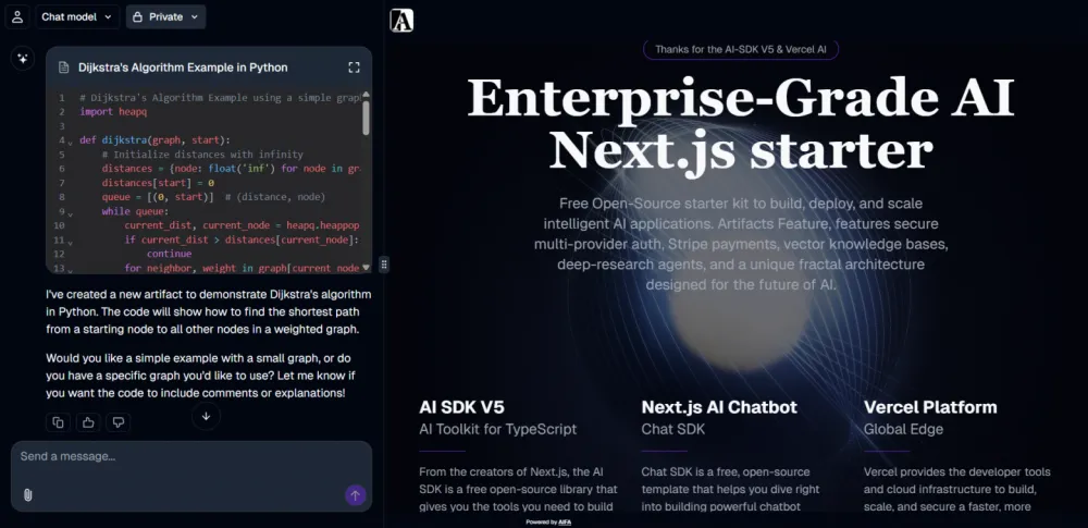
<h3>2.1.6.2. When to use a file config</h3><p>Optimal scenarios for a config file:</p><ul><li><p>Projects with no more than 10-15 pages</p></li><li><p>Static content that rarely changes</p></li><li><p>Prototyping and MVPs — quick start without a database</p></li><li><p>Landing pages with a fixed structure</p></li></ul><p>When to switch to a database:<br>In the production version of a large project, the file approach makes sense only with a small number of pages. Most cases require storing this information in a database for dynamic content management.</p><h3>2.1.6.3. Config structure</h3><pre><code>export const PublicPagesConfig = {
pages: [
{
metadata: {
id: "public",
title: "Enterprise-Grade AI Next.js starter",
description: "Free Open-Source starter kit...",
slug: ["public", "test"],
type: "hero-section",
},
sections: [
{
id: "test-block",
type: "hero-section",
headerContent: { /* SEO headers */ },
bodyContent: {},
footerContent: { /* Action buttons */ },
videoUrl: "/_static/video/ai-loop.mp4",
contentWrapperClassName: "text-white",
} as SectionConfig,
],
},
] as PageConfig[],
};
</code></pre><h3>2.1.6.4. Categorization principle for configs</h3><p>Important architectural decision: Placing the config in the directory public/(_service)/(_config)/ indicates its affiliation with public pages.</p><p>Scaling by categories:</p><ul><li><p>public-pages-config.ts — public pages (landing, about, contact)</p></li><li><p>docs-pages-config.ts — documentation with extended navigation</p></li><li><p>admin-pages-config.ts — admin panels</p></li><li><p>blog-pages-config.ts — blog posts and articles</p></li></ul><p>Each category gets:</p><ul><li><p>A dedicated config file</p></li><li><p>Specialized section types</p></li><li><p>Unique rendering logic</p></li></ul><h3>2.1.6.5. Interaction with AI generation</h3><p>For AI systems, the config serves as:</p><ul><li><p>A structure template — how PageConfig objects should look</p></li><li><p>A data example — reference values for generation</p></li><li><p>Type validation — strict typing through TypeScript</p></li></ul><p>Workflow:</p><ol><li><p>AI analyzes the existing config</p></li><li><p>Generates a new PageConfig based on the prompt</p></li><li><p>The developer adds the config to the pages array</p></li><li><p>The system automatically picks up the new routes</p></li></ol><h3>2.1.6.6. Advantages and limitations</h3><p>Advantages of the file approach:</p><ul><li><p>Versioning via Git</p></li><li><p>Type safety at compile time</p></li><li><p>Zero latency — no database queries</p></li><li><p>Easy deployment — static generation</p></li></ul><p>Limitations:</p><ul><li><p>No dynamic management</p></li><li><p>Rebuild required on changes</p></li><li><p>Not suitable for user-generated content</p></li><li><p>Scaling issues beyond 20-30 pages</p></li></ul><h3>2.1.6.7. Component</h3>
<pre><code>// @/app/@right/public/(_servise)/(_config)/public-pages-config.ts
import {
PageConfig,
SectionConfig,
} from "@/app/@right/(_service)/(_types)/page-wrapper-types";
export const PublicPagesConfig = {
pages: [
{
metadata: {
id: "public",
title: "Enterprise-Grade AI Next.js starter",
description: "Free Open-Source starter kit...",
slug: ["public", "test"],
type: "hero-section",
},
sections: [
{
id: "test-block",
type: "hero-section",
headerContent: {
announcement: {
badgeText: "Thanks",
descriptionText: "AI-SDK V5 & Vercel AI",
href: "https://github.com/aifa-agi/aifa",
},
heading: "Enterprise-Grade AI Next.js starter",
description:
"Free Open-Source starter kit to build, deploy, and scale intelligent AI applications. Artifacts Feature, features secure multi-provider auth, Stripe payments, vector knowledge bases, deep-research agents, and a unique fractal architecture designed for the future of AI.",
showBorder: false,
headingLevel: 1,
},
bodyContent: {},
footerContent: {
actions: [
{
label: "Get Started",
href: "/https://github.com/aifa-agi/aifa",
variant: "default",
},
{ label: "Browse Docs", href: "/docs", variant: "ghost" },
],
},
videoUrl: "/_static/video/ai-loop.mp4",
contentWrapperClassName: "text-white",
} as SectionConfig,
],
},
] as PageConfig[],
};
</code></pre><p>2.1.6.7. Conclusion</p><p><br>public-pages-config.ts is a practical solution for small and medium-sized projects, providing a balance between ease of management and functionality. For large projects, this approach serves as an excellent starting point before migrating to a database-driven architecture.</p><h3>2.1.7. utils.ts: helper configuration functions</h3><p>Utilities for working with page configs. Contains two key functions: getAllPublicPages() — filters all pages with the "public" prefix for static generation, and getPageBySlug() — finds a specific page by exact match of the slug array, case-insensitive.</p><pre><code>// @app/@right/public/(_servise)/(_libs)/utils.ts
import {
PageConfig,
SlugType,
} from "@/app/@right/(_service)/(_types)/page-wrapper-types";
import { PublicPagesConfig } from "../(_config)/public-pages-config";
export function getAllPublicPages(): PageConfig[] {
return PublicPagesConfig.pages.filter(
(page: PageConfig) => page.metadata.slug?.[0] === "public"
);
}
export function getPageBySlug(slug: SlugType): PageConfig | undefined {
return PublicPagesConfig.pages.find(
(page: PageConfig) =>
JSON.stringify(
page.metadata.slug?.map((s: string) => s.toLowerCase())
) === JSON.stringify(slug.map((s: string) => s.toLowerCase()))
);
}</code></pre><h3>2.1.8. header-section.tsx: unified section header</h3><p>Standardized header component for all section types. Provides consistency through optional elements: announcement, H1/H2 heading, description. Plays a key role in SEO optimization and visual consistency of AI-generated pages.</p>
<pre><code>// @/app/@right/(_service)/(_components)/page-transformer-components/header-sections-components/header-section.tsx
import React from "react";
import { cn } from "@/lib/utils";
import {
PageHeaderDescription,
PageHeaderHeading,
} from "./page-header-elements";
import { Announcement } from "./announcement";
import { HeaderContentConfig } from "../../../(_types)/page-wrapper-types";
export type HeaderSectionProps = {
headerContent: HeaderContentConfig;
} & React.HTMLAttributes<HTMLDivElement>;
export function HeaderSection({
headerContent,
className,
...props
}: HeaderSectionProps) {
if (!headerContent) return null;
const {
announcement,
heading,
headingLevel = 1,
description,
showBorder = false,
} = headerContent;
return (
<section
className={cn(
showBorder && "border-t-4 border-b-4 border-primary",
className
)}
{...props}
>
<div className="container mx-auto px-4">
<div className="flex flex-col items-center gap-1 py-8 md:py-10 lg:py-12">
{announcement && (
<Announcement
badgeText={announcement.badgeText}
descriptionText={announcement.descriptionText}
href={announcement.href}
/>
)}
<PageHeaderHeading level={headingLevel}>{heading}</PageHeaderHeading>
{description && (
<PageHeaderDescription>{description}</PageHeaderDescription>
)}
</div>
</div>
</section>
);
}
</code></pre><h3>2.1.9. header-section.tsx: unified section header</h3><p>Atomic components for building headers: PageHeaderHeading with H1/H2 support, PageHeaderDescription for subtitles, PageActions for placing buttons. They use createElement for dynamically generating HTML tags with the correct SEO hierarchy.</p><pre><code>// @app/@right/(_service)/(_components)/page-transformer-components/header-sections-components/page-header-elements.tsx
import { HTMLAttributes, createElement } from "react";
import { cn } from "@/lib/utils";
type HeadingTag = "h1" | "h2";
interface PageHeaderHeadingProps extends HTMLAttributes<HTMLHeadingElement> {
level?: 1 | 2;
}
function PageHeaderHeading({
className,
level = 1,
...props
}: PageHeaderHeadingProps) {
// Choosing tag by level
const Heading: HeadingTag = level === 1 ? "h1" : "h2";
const h1Classes = "text-2xl sm:text-3xl md:text-6xl lg:text-7xl";
const h2Classes = "text-lg sm:text-xl md:text-3xl lg:text-4xl";
// Correct use of createElement
return createElement(Heading, {
className: cn(
"text-center font-bold leading-tight tracking-tighter font-serif",
level === 1 ? h1Classes : h2Classes,
className
),
...props,
});
}
function PageHeaderDescription({
className,
...props
}: HTMLAttributes<HTMLParagraphElement>) {
return (
<p
className={cn(
"max-w-2xl text-balance text-center text-base font-light text-muted-foreground sm:text-lg",
className
)}
{...props}
/>
);
}
function PageActions({ className, ...props }: HTMLAttributes<HTMLDivElement>) {
return (
<div
className={cn(
"flex w-full items-center justify-center gap-2 pt-2",
className
)}
{...props}
/>
);
}
// Export components
export { PageActions, PageHeaderDescription, PageHeaderHeading };
</code></pre><h3>2.1.10. announcement.tsx: announcement component</h3><p>Interactive badge for announcements and notifications. Supports navigation, keyboard control, and conditional rendering. Automatically hides if there is no content. Used to draw attention to important updates or links.<br>// @app/@right/(_service)/(_components)/page-transformer-components/header-sections-components/announcement.tsx</p>
<pre><code>"use client";
import { useRouter } from "next/navigation";
import { Badge } from "@/components/ui/badge";
import { ArrowRight } from "lucide-react";
import { cn } from "@/lib/utils";
interface AnnouncementProps {
badgeText?: string; // Made optional
descriptionText?: string; // Made optional
href?: string; // Made optional
className?: string;
}
export function Announcement({
badgeText,
descriptionText,
href,
className,
}: AnnouncementProps) {
const router = useRouter();
const handleOnClick = () => {
if (href) {
router.push(href);
}
};
// If no badge text, description, or href, return null
if (!badgeText && !descriptionText && !href) {
return null;
}
return (
<div classname="{cn(" "flex="" cursor-pointer="" items-center="" gap-2="" rounded-full="" border="" border-primary="" bg-muted="" px-3="" py-1="" text-sm="" transition-colors="" hover:bg-muted="" 80",="" )}="" onclick="{handleOnClick}" role="link" tabindex="{0}" onkeydown="{(e)" ==""> {
if (e.key === "Enter" || e.key === " ") {
handleOnClick();
}
}}
>
{badgeText && (
<badge variant="secondary" classname="text-xs">
{badgeText}
</badge>
)}
{descriptionText && (
<span classname="text-muted-foreground">{descriptionText}</span>
)}
{href && }
</div>
);
}
</code></pre><h3>2.1.11. footer-section.tsx: unified actions for sections</h3><p>Standardized footer with action buttons. Supports multiple buttons with different styling options. Ensures consistency of CTA elements across all sections. Automatically hides when there are no actions.<strong><br>// @app/@right/(_service)/(_components)/page-transformer-components/footer-sections-components/footer-section.tsx</strong></p><pre><code>"use client";
import { useRouter } from "next/navigation";
import type { HTMLAttributes } from "react";
import { cn } from "@/lib/utils";
import { Button } from "@/components/ui/button";
import { PageActions } from "../header-sections-components/page-header-elements";
interface FooterAction {
label: string;
href: string;
variant?:
| "default"
| "secondary"
| "destructive"
| "outline"
| "ghost"
| "link";
}
interface FooterSectionProps extends HTMLAttributes<HTMLDivElement> {
actions?: FooterAction[];
}
export function FooterSection({
actions,
className,
...props
}: FooterSectionProps) {
const router = useRouter();
if (!actions || actions.length === 0) {
return null;
}
return (
<section className={cn("py-4 md:py-6 lg:py-8", className)} {...props}>
<div className="container mx-auto px-4">
<PageActions>
{actions.map((action) => (
<Button
key={action.href} // href must be unique!
size="sm"
variant={action.variant || "default"}
onClick={() => router.push(action.href)}
>
{action.label}
</Button>
))}
</PageActions>
</div>
</section>
);
}
</code></pre><h3>2.1.12. body-section.tsx: container for arbitrary content</h3><h3>2.1.12.1. Purpose and Philosophy</h3><p>BodySection is an extremely flexible container for the main content of sections. Unlike the strictly standardized Header and Footer, this component provides full freedom for placing any React content.</p><h3>2.1.12.2. Principles of content generation</h3><p>Critically important: Content for bodyContent must be generated as regular TSX without .map() elements, where all elements are presented in expanded form:<br></p>
<pre><code>// ✅ Correct - expanded TSX
bodyContent: (
<>
<div className="grid grid-cols-1 md:grid-cols-3 gap-6">
<div className="feature-card">
<h3>Feature 1</h3>
<p>Description 1</p>
</div>
<div className="feature-card">
<h3>Feature 2</h3>
<p>Description 2</p>
</div>
<div className="feature-card">
<h3>Feature 3</h3>
<p>Description 3</p>
</div>
</div>
</>
)
// ❌ Incorrect - using .map()
bodyContent: (
<div className="grid">
{features.map(feature => <FeatureCard key={feature.id} {...feature} />)}
</div>
)
</code></pre><h3>2.1.12.3. When to use custom components</h3><p>If a section requires complex logic (state, effects, interactivity), create a standalone component and add it to PageHtmlTransformer as a separate </p><pre><code>case:
switch (section.type) {
case "interactive-pricing-section": {
return <CustomPricingCalculator key={config.id} {...config} />;
}
// standard cases...
}</code></pre><h3>2.1.12.3. Technical implementation</h3><p>The component checks for the presence of children and renders them without additional processing. If there is no content, it returns null, ensuring clean markup without empty blocks.<br></p><pre><code>// @/app/@right/(_service)/(_components)/page-transformer-components/body-sections-components/body-section.tsx
export function BodySection({ children, className, ...props }: BodySectionProps) {
const hasChildren = children !== null && children !== undefined &&
!(Array.isArray(children) && children.length === 0) &&
!(typeof children === "string" && children === "");
if (!hasChildren) return null;
return (
<div className={cn(className)} {...props}>
{children}
</div>
);
}</code></pre><h3>2.1.12.4. Component</h3><pre><code>// @app/@right/(_service)/(_components)/page-transformer-components/body-sections-components/body-section.tsx
import type { HTMLAttributes, ReactNode } from "react";
import { cn } from "@/lib/utils";
import { SectionType } from "../../../(_types)/page-wrapper-types";
interface BodySectionProps extends HTMLAttributes<HTMLDivElement> {
children?: ReactNode | null;
type: SectionType;
}
/**
* BodySection component.
* Renders children if present,
* otherwise renders an empty section with a default height (in rem) if provided,
* or renders nothing.
*/
export function BodySection({
children,
className,
...props
}: BodySectionProps) {
const defaultHeightRem = 0;
const hasChildren =
children !== null &&
children !== undefined &&
// Covers case when children = [] or ""
!(Array.isArray(children) && children.length === 0) &&
!(typeof children === "string" && children === "");
if (!hasChildren && defaultHeightRem) {
return (
<div
className={cn(className)}
style={{ height: ${defaultHeightRem}rem }}
{...props}
>
{/* Empty section with default height */}
</div>
);
}
if (!hasChildren) {
return null;
}
// Normal case: render content
return (
<div className={cn(className)} {...props}>
{children}
</div>
);
}</code></pre><h3>2.1.12.5. ConclusionBodySection acts as a bridge between the standardized system architecture and the creative freedom of AI generation, providing a balance between control and flexibility.</h3><h4>2.2. Custom complex componentsCustom components are designed to implement complex interactive functionality beyond the capabilities of the standard architecture. These components are used when state management, advanced animations, real-time interaction, or unique business logic is required.</h4><p>h4 When to use Custom components:</p>
<ul><li><p>Interactive elements — forms with validation, calculators, product configurators</p></li><li><p>Animated presentations — complex transitions, parallax effects, automatic sliders</p></li><li><p>Real-time functionality — chats, notifications, live data</p></li><li><p>Adaptive logic — components with radically different behavior on desktop/mobile</p></li><li><p>Unique UI patterns — non-standard interface elements, project-specific</p></li></ul><p>Integration with architecture:<br>Custom components are added to PageHtmlTransformer as separate cases in a switch statement, gaining access to the context of the theme, device, and other system parameters. They maintain a consistent style through the use of shared CSS classes and design tokens, but are given complete freedom to implement internal logic.</p><p>This approach ensures a balance between standardizing the majority of content and creative freedom in implementing complex interactive elements.</p><h3>2.2.1. Directive for handling custom components</h3><h3>2.2.1.1. About Wrappers</h3><p>Prohibition of wrappers for custom components</p><p>Custom components should be returned directly without a Wrapper or FullScreenWrapper, as they manage their own structure, padding, and layers.</p><h3>2.2.1.2. About custom component types</h3><p>Placement of types in the component</p><p>The prop interfaces of the custom component are declared at the top of the component itself. Data is passed through the customComponentsAnyTypeData field in the section config.</p><h3>2.2.1.3 Extended SectionType:</h3><p>Adding a new section type</p><p>A unique type is added for each custom component to the enum SectionType in the page-wrapper-types.ts file for correct typing and handling in the switch statement.</p><pre><code>// @/app/@right/(_service)/(_types)/page-wrapper-types.ts
// ...
export type SectionType ="hero-section" | “new-custom-section”;
</code></pre><h3>2.2.1.4. Update cases in the PageHtmlTransformer</h3><p>Handling a custom case</p><p>A new case is added to the PageHtmlTransformer to handle the custom section type with direct data transfer from customComponentsAnyTypeData to the component's props.</p><pre><code>case "new-custom-section":
return (
<NewCustomSection
key={config.id}
customData={section.customComponentsAnyTypeData.customData}
/>
);</code></pre><h3>2.2.1.5. Custom Config</h3><p>Configuration structure</p><p>Example of a page configuration with a custom section, where all specific data is placed in the customComponentsAnyTypeData object with an arbitrary structure to meet the component's needs.</p>
<pre><code>export const PublicPagesConfig = {
pages: [
{
metadata: {
id: "CIUD",
title: "1",
description: "2",
slug: ["public", "name"],
type: "new-custom-section",
},
sections: [
{
id: "new-custom-section",
type: "new-custom-section",
customComponentsAnyTypeData: {
metaData: {
metaTitle: "1",
metaDescription: "2",
},
customData: {
mediaUrl: "/_static/illustrations/3.png",
title: "4",
description:
"5",
},
},
} as SectionConfig,
],
},
] as PageConfig[],
</code></pre><h3>2.2.2. Custom component example</h3><h3>2.3.2.1. DoublePresentation</h3><div class="lightgallery"><a href="https://cdn.tekkix.com/imgs/2026/02/habrcom/content/594c493c2fb325f31b146fb8621b.webp"><figure><img class="lazy" width="1000" src="data:image/png;base64,iVBORw0KGgoAAAANSUhEUgAAAAEAAAABCAQAAAC1HAwCAAAAC0lEQVR42mNkYAAAAAYAAjCB0C8AAAAASUVORK5CYII=" data-src="https://cdn.tekkix.com/imgs/2026/02/habrcom/content/594c493c2fb325f31b146fb8621b.webp" alt="The process of developing and promoting websites using ChatGPT and Next.js 15 for SEO automation"></figure></a></div><h3>2.3.2.1.1. Updating main types</h3><pre><code>// @/app/@right/(_service)/(_types)/page-wrapper-types.ts
// Add new section type
export type SectionType =
| "hero-section"
| "cta-section"
| "double-presentation-section" // New type
// ... other types</code></pre><h3>2.3.2.1.2. Add new case with current data to : PageHtmlTransformer</h3><pre><code>case "double-presentation-section":
return (
<DoublePresentation
key={section.id}
metaData={section.customComponentsAnyTypeData.metaData}
leftItem={section.customComponentsAnyTypeData.leftItem}
rightItem={section.customComponentsAnyTypeData.rightItem}
/>
);</code></pre><h3>2.3.2.1.3. page-wrapper-types.ts</h3><pre><code>// app/@right/(_service)/(_types)/page-wrapper-types.ts
export interface MetadataConfig {
title?: string;
description?: string;
}
export type CuidString = string;
export interface PageMetadata {
id: CuidString;
title: string;
description: string;
image?: string;
slug?: string[];
type: SectionType;
}
export type SectionType =
| "hero-section"
| "cta-section"
| "faq-section"
| "features-section"
| "testimonials-section"
| "pricing-section"
| "contact-section"
| "blog-posts-section"
| "product-grid-section"
| "image-gallery-section"
| "text-block-section"
| "video-section"
| "team-section"
| "about-us-section"
| "newsletter-section"
| "social-proof-section"
| "comparison-table-section"
| "map-section"
| "custom-html-section"
| "changelog-section"
| "comparison-two-column-section"
| "comparison-three-column-section"
| "feature-showcase-section"
| "double-presentation-section";
export interface BaseSection {
id: string;
type: SectionType;
className?: string;
}
export interface HeaderContentConfig {
announcement?: {
badgeText?: string;
descriptionText?: string;
href?: string;
};
heading: string;
headingLevel?: 1 | 2;
description?: string;
showBorder?: boolean;
}
export interface FooterContentConfig {
actions?: {
label: string;
href: string;
variant?:
| "default"
| "secondary"
| "destructive"
| "outline"
| "ghost"
| "link";
}[];
}
export interface SectionConfig extends BaseSection {
type: SectionType;
headerContent: HeaderContentConfig;
bodyContent?: React.ReactNode;
footerContent?: FooterContentConfig;
videoUrl?: string;
imageUrl?: string;
sectionClassName?: string;
contentWrapperClassName?: string;
customComponentsAnyTypeData?: any;
}
export type Section = SectionConfig;
export interface PageConfig {
metadata: PageMetadata;
sections: Section[];
}
export type SlugType = string[];
</code></pre><h3>2.3.2.1.4. Config, example:</h3><pre><code>// @/app/@right/public/(_servise)/(_config)/public-pages-config.ts
import {
PageConfig,
SectionConfig,
} from "@/app/@right/(_service)/(_types)/page-wrapper-types";
export const PublicPagesConfig = {
pages: [
{
metadata: {
id: "public",
title: "Enterprise-Grade AI Next.js starter",
description: "Free Open-Source starter kit...",
slug: ["public", "test"],
type: "hero-section",
},
sections: [
{
id: "test-block",
type: "hero-section",
headerContent: {
announcement: {
badgeText: "Thanks",
descriptionText: "AI-SDK V5 & Vercel AI",
href: "https://github.com/aifa-agi/aifa",
},
heading: "Enterprise-Grade AI Next.js starter",
description:
"Free Open-Source starter kit to build, deploy, and scale intelligent AI applications. Artifacts Feature, features secure multi-provider auth, Stripe payments, vector knowledge bases, deep-research agents, and a unique fractal architecture designed for the future of AI.",
showBorder: false,
headingLevel: 1,
},
bodyContent: {},
footerContent: {
actions: [
{
label: "Get Started",
href: "/https://github.com/aifa-agi/aifa",
variant: "default",
},
{ label: "Browse Docs", href: "/docs", variant: "ghost" },
],
},
videoUrl: "/_static/video/ai-loop.mp4",
contentWrapperClassName: "text-white",
} as SectionConfig,
],
},
{
metadata: {
id: "interactive-ai",
title: "Interactive AI Demo",
description: "Demo: DoublePresentation custom case",
slug: ["public", "example"],
type: "double-presentation-section",
},
sections: [
{
id: "double-presentation-demo",
type: "double-presentation-section",
customComponentsAnyTypeData: {
metaData: {
metaTitle: "Interactive AI: Where Conversation Builds the UI",
metaDescription: "Discover what makes AIFA revolutionary...",
},
leftItem: {
mediaUrl: "/_static/illustrations/ai-chat.png",
title: "Ai Artifacts Chatbot",
description:
"As the AI chatbot speaks, it highlights elements...",
},
rightItem: {
mediaUrl: "/_static/illustrations/ai-web.png",
title: "Related Pages",
description:
"Click any UI element, and the AI provides instant context...",
},
},
} as SectionConfig,
],
},
] as PageConfig[],
};</code></pre><h3>2.3.2.1.5. Component</h3><pre><code>// @/app/@right/(_service)/(_components)/page-transformer-components/custom-sections/custom-double-prsentation.tsx
"use client";
import React, { useState, useEffect } from "react";
import { motion } from "framer-motion";
import Image from "next/image";
import { cn } from "@/lib/utils";
import { useMediaQuery } from "@/hooks/use-media-query";
interface PresentationMeta {
metaTitle: string;
metaDescription: string;
}
interface PresentationItem {
mediaUrl: string;
title: string;
description: string;
}
interface DoublePresentationProps {
metaData: PresentationMeta;
leftItem: PresentationItem;
rightItem: PresentationItem;
}
export default function DoublePresentation({
metaData,
leftItem,
rightItem,
}: DoublePresentationProps) {
const { isMobile } = useMediaQuery();
// Desktop animation state
const [activeContainer, setActiveContainer] = useState<"left" | "right">(
"left"
);
const [sliderKey, setSliderKey] = useState(0);
// Desktop auto-switching effect
useEffect(() => {
// Only run animation cycle on desktop
if (isMobile) return;
let sliderTimer: NodeJS.Timeout;
let transitionTimer: NodeJS.Timeout;
const startAnimationCycle = () => {
setSliderKey((prev) => prev + 1);
sliderTimer = setTimeout(() => {
setActiveContainer((prev) => (prev === "left" ? "right" : "left"));
transitionTimer = setTimeout(() => {
startAnimationCycle();
}, 500);
}, 9000);
};
startAnimationCycle();
return () => {
clearTimeout(sliderTimer);
clearTimeout(transitionTimer);
};
}, [isMobile]);
// Return null while determining screen size
if (isMobile === null) {
return null;
}
// Common CSS classes
const metaBlockClass = "text-center max-w-3xl flex flex-col items-center";
const descriptionClass =
"mb-12 max-w-xl text-base text-muted-foreground text-center";
const desktopTitleClass =
"mb-6 max-w-3xl font-serif font-bold leading-tight md:text-2xl lg:text-4xl";
const desktopDescriptionClass =
"mb-12 max-w-xl text-lg text-muted-foreground md:text-xl text-center";
// Mobile card renderer
const renderMobileCard = (item: PresentationItem) => (
<div className="relative flex flex-col rounded-xl bg-gray-900 text-white shadow-lg mb-6 overflow-hidden">
<div className="w-full relative" style={{ paddingTop: "56.25%" }}>
<Image
src={item.mediaUrl}
alt={item.title}
fill
className="object-cover rounded-t-xl"
sizes="100vw"
priority
/>
</div>
<div className="flex flex-col p-4">
<h2 className="text-xl font-bold mb-2">{item.title}</h2>
<p className="text-gray-300 mb-2 text-base min-h-16">
{item.description}
</p>
</div>
</div>
);
// Desktop card renderer
const renderDesktopCard = (item: PresentationItem, isActive: boolean) => (
<motion.div
layout
animate={{ flex: isActive ? "7 1 0%" : "3 1 0%" }}
transition={{ duration: 0.5 }}
className="relative flex flex-col rounded-lg overflow-hidden bg-transparent text-white p-0 shadow-lg h-[30rem] flex-shrink-0"
>
<div className="relative w-full h-60 mb-4 rounded-xl overflow-hidden border-4 border-gray-700">
<Image
src={item.mediaUrl}
alt={item.title}
fill
className="object-cover"
priority
sizes="(max-width: 768px) 100vw, (max-width: 1200px) 50vw, 33vw"
/>
</div>
<div className="flex flex-col pt-6">
<h2 className="text-2xl font-bold mb-2 whitespace-nowrap overflow-hidden text-ellipsis">
{item.title}
</h2>
<div className="relative w-full h-px bg-gray-700 mb-4">
<motion.div
key={slider-${item.title}-${sliderKey}}
className={cn(
"absolute top-0 left-0 h-full",
isActive ? "bg-primary" : "bg-gray-700"
)}
initial={{ width: 0 }}
animate={{ width: isActive ? "100%" : "0%" }}
transition={
isActive ? { duration: 9, ease: "linear" } : { duration: 0 }
}
/>
</div>
<p className="text-gray-300 mb-4 text-sm line-clamp-4 min-h-[4rem]">
{item.description}
</p>
</div>
</motion.div>
);
// Mobile layout
if (isMobile) {
return (
<section className="w-full pt-20">
<div className="container mx-auto px-4 flex flex-col items-center">
<div className={metaBlockClass}>
<h2 className="text-xl font-bold mb-4">{metaData.metaTitle}</h2>
<p className={descriptionClass}>{metaData.metaDescription}</p>
</div>
<div className="w-full flex flex-col">
{renderMobileCard(leftItem)}
{renderMobileCard(rightItem)}
</div>
</div>
</section>
);
}
// Desktop layout
return (
<section className="w-full pt-28">
<div className="container mx-auto px-4 flex flex-col items-center gap-12">
<div className={metaBlockClass}>
<h2 className={desktopTitleClass}>{metaData.metaTitle}</h2>
<p className={desktopDescriptionClass}>{metaData.metaDescription}</p>
</div>
<div className="flex gap-6 w-full max-w-6xl">
{renderDesktopCard(leftItem, activeContainer === "left")}
{renderDesktopCard(rightItem, activeContainer === "right")}
</div>
</div>
</section>
);
}</code></pre><div class="lightgallery"><a href="https://cdn.tekkix.com/imgs/2026/02/habrcom/content/32f8dccbe5d3bcd5e4a114ab70cd.webp"><figure><img class="lazy" width="1000" src="data:image/png;base64,iVBORw0KGgoAAAANSUhEUgAAAAEAAAABCAQAAAC1HAwCAAAAC0lEQVR42mNkYAAAAAYAAjCB0C8AAAAASUVORK5CYII=" data-src="https://cdn.tekkix.com/imgs/2026/02/habrcom/content/32f8dccbe5d3bcd5e4a114ab70cd.webp" alt="Demonstration of a ready SEO‑friendly website created through the AI generator on Next.js 15 and ChatGPT"></figure></a></div><h5>Roma Armstromg</h5><p>AI Architector</p>
<p>As always, I present the source code of the ready-made solution so that you can immediately start creating blogs, stores, landing pages, etc. <a rel="noopener noreferrer nofollow" href="https://github.com/aifa-agi/aifa" class="" target="_blank">https://github.com/aifa-agi/aifa</a></p>
<div class="read_more">
<div class="title">Read also:</div>
<ul>
<li><a href="/articles/ai/2024/12/how-llms-are-changing-system-architecture-f">
How LLMs are changing system architecture: from simple data pipelines to intelligent autonomous agents</a></li>
<li><a href="/articles/hardware/2025/05/writing-a-simple-virtual-machine">Writing a Simple Virtual Machine</a></li>
<li><a href="/articles/software/2026/05/for-30-years-we-implemented-ansys-in-russia-t">For 30 years we implemented Ansys in Russia. Then it left — we had to sit down and write our own CAE for additive printing</a></li>
</ul>
</div>
</div>
</div>
</article>
<div class="widget-tags">
<ul><li><a rel="nofollow" href="/search?tag=++
next&key=tags">
next</a></li><li><a rel="nofollow" href="/search?tag=chatgpt&key=tags">chatgpt</a></li><li><a rel="nofollow" href="/search?tag=ai&key=tags">ai</a></li><li><a rel="nofollow" href="/search?tag=v0&key=tags">v0</a></li><li><a rel="nofollow" href="/search?tag=open+source&key=tags">open source</a></li><li><a rel="nofollow" href="/search?tag=github&key=tags">github</a></li><li><a rel="nofollow" href="/search?tag=ai+generator&key=tags">ai generator</a></li></ul>
</div>
<div id="emodzy"><div><a class='like' onclick='return false;' href='#'><span>0</span></a></div><div><a class='dislike' onclick='return false;' href='#'><span>0</span></a></div><div><a class='droll' onclick='return false;' href='#'><span>0</span></a></div><div><a class='love' onclick='return false;' href='#'><span>0</span></a></div><div><a class='cat' onclick='return false;' href='#'><span>0</span></a></div><div><a class='wow' onclick='return false;' href='#'><span>0</span></a></div></div>
<div class="article-comments">
<div class="section-title add_comment">
<div class="title">Comments</div>
</div>
<div class="comments">
<div id="comments-wrapper">
<ol class="comment-list" id="comments"></ol>
</div>
<div id="comments-tpanel">
<div id="tpanel-refresh"></div>
<div id="tpanel-new"></div>
</div>
</div><h4 id="comment-new-link">
<a href="#" class="btn btn-default">Write comment</a>
</h4>
<div id="comment-form-placeholder">
<form id="comment-form" action="#" method="post" class="well">
<div id="comment-preview-placeholder"></div>
<input type="hidden" name="thread" value="resource-38771"/>
<input type="hidden" name="parent" value="0"/>
<input type="hidden" name="id" value="0"/>
<input type="hidden" name="form_key" value="8a8ea19d02682d829f2315028adc7d25">
<div class="form-group left">
<input type="text" name="name" value="" id="comment-name" class="form-control" placeholder="Name"/>
<span class="error"></span>
</div>
<div class="form-group right">
<input type="text" name="email" value="" id="comment-email" class="form-control" placeholder="Email"/>
<span class="error"></span>
</div>
<div class="form-group">
<textarea name="text" id="comment-editor" cols="30" rows="6" class="form-control"></textarea>
<span class="error" id="text-error"></span>
</div>
<div class="form-group">
<label for="comment-captcha" id="comment-captcha222">Enter the amount 20 + 20</label>
<input type="text" name="captcha" value="" id="comment-captcha" class="form-control" />
<span class="error"></span>
</div>
<div class="form-actions">
<input type="submit" class="input-btn submit" value="Write"
title="Ctrl + Shift + Enter"/>
<span class="time"></span>
</div>
</form>
</div>
</div>
</div>
<!-- Боковой сайтбар -->
<div class="col-md-4 sb_right">
<h3>Relevant news on the topic "AI"</h3>
<div class="widget">
<article class="article thumb-article tpl_slider_t2">
<div class="article-img">
<img class="lazy" width="1000" height="625" src="data:image/png;base64,iVBORw0KGgoAAAANSUhEUgAAAAEAAAABCAQAAAC1HAwCAAAAC0lEQVR42mNkYAAAAAYAAjCB0C8AAAAASUVORK5CYII=" data-src="https://cdn.tekkix.com/imgs/2026/05/habrcom/big/9b62a56f61e5b1823ea9176217bb.webp" alt="How Adaptive RAG Works That Doesn’t Need an LLM At All" >
</div>
<div class="article-body">
<h4 class="article-title"><a href="/articles/ai/2026/06/how-adaptive-rag-works-that-doesn-t-need-an-l">How Adaptive RAG Works That Doesn’t Need an LLM At All</a></h4>
<ul class="article-meta">
<li class="time">09:39</li>
<li class="date">02.06.2026</li> </ul>
<ul class="article-info">
<li class="article-category"><a href="/">AI</a></li>
</ul>
</div>
</article>
</div>
<div class="widget subscribe-widget">
<div class="widget-title">Subscribe to the newsletter</div>
<form class="subscribe" action="#" method="post">
<input type="hidden" name="sx_action" value="subscribe">
<input class="input" type="email" name="email" placeholder="Enter your email">
<button type="submit" class="input-btn">Subscribe</button>
</form> </div>
<article class="article thumb-article tpl_slider_t2">
<div class="article-img">
<img class="lazy" width="1000" height="625" src="data:image/png;base64,iVBORw0KGgoAAAANSUhEUgAAAAEAAAABCAQAAAC1HAwCAAAAC0lEQVR42mNkYAAAAAYAAjCB0C8AAAAASUVORK5CYII=" data-src="https://cdn.tekkix.com/imgs/2026/06/habrcom/big/3634a7d6fe7b02df642c8430f01e.webp" alt="Why only 27% of organizations are ready for AI" >
</div>
<div class="article-body">
<h4 class="article-title"><a href="/articles/ai/2026/06/why-only-27-of-organizations-are-ready-for-ai">Why only 27% of organizations are ready for AI</a></h4>
<ul class="article-meta">
<li class="time">10:21</li>
<li class="date">02.06.2026</li> </ul>
<ul class="article-info">
<li class="article-category"><a href="/">AI</a></li>
</ul>
</div>
</article>
<article class="article thumb-article tpl_slider_t2">
<div class="article-img">
<img class="lazy" width="1000" height="625" src="data:image/png;base64,iVBORw0KGgoAAAANSUhEUgAAAAEAAAABCAQAAAC1HAwCAAAAC0lEQVR42mNkYAAAAAYAAjCB0C8AAAAASUVORK5CYII=" data-src="https://cdn.tekkix.com/imgs/2026/06/habrcom/big/1d5a3dc2f8707395608fc03d1825.webp" alt="Mathematics of Large Numbers: From a Zero-Sum Game to a Growing-Sum Game" >
</div>
<div class="article-body">
<h4 class="article-title"><a href="/articles/ai/2026/06/mathematics-of-large-numbers-from-a-zero-sum">Mathematics of Large Numbers: From a Zero-Sum Game to a Growing-Sum Game</a></h4>
<ul class="article-meta">
<li class="time">10:17</li>
<li class="date">02.06.2026</li> </ul>
<ul class="article-info">
<li class="article-category"><a href="/">AI</a></li>
</ul>
</div>
</article>
<article class="article thumb-article tpl_slider_t2">
<div class="article-img">
<img class="lazy" width="1000" height="625" src="data:image/png;base64,iVBORw0KGgoAAAANSUhEUgAAAAEAAAABCAQAAAC1HAwCAAAAC0lEQVR42mNkYAAAAAYAAjCB0C8AAAAASUVORK5CYII=" data-src="https://cdn.tekkix.com/imgs/2026/06/habrcom/big/8ab2830b3c88691434236c8413c0.webp" alt="Curiosity as an operating system" >
</div>
<div class="article-body">
<h4 class="article-title"><a href="/articles/ai/2026/06/curiosity-as-an-operating-system">Curiosity as an operating system</a></h4>
<ul class="article-meta">
<li class="time">13:09</li>
<li class="date">09.06.2026</li> </ul>
<ul class="article-info">
<li class="article-category"><a href="/">AI</a></li>
</ul>
</div>
</article>
<article class="article thumb-article tpl_slider_t2">
<div class="article-img">
<img class="lazy" width="1000" height="625" src="data:image/png;base64,iVBORw0KGgoAAAANSUhEUgAAAAEAAAABCAQAAAC1HAwCAAAAC0lEQVR42mNkYAAAAAYAAjCB0C8AAAAASUVORK5CYII=" data-src="https://cdn.tekkix.com/imgs/2026/05/habrcom/big/880fdb0f6af2720aedac19f915ac.webp" alt="Artificial Intelligence in Education: Digital Profiles, Avatars and Personal Learning Paths" >
</div>
<div class="article-body">
<h4 class="article-title"><a href="/articles/ai/2026/06/artificial-intelligence-in-education-digital">Artificial Intelligence in Education: Digital Profiles, Avatars and Personal Learning Paths</a></h4>
<ul class="article-meta">
<li class="time">10:05</li>
<li class="date">02.06.2026</li> </ul>
<ul class="article-info">
<li class="article-category"><a href="/">AI</a></li>
</ul>
</div>
</article>
<article class="article thumb-article tpl_slider_t2">
<div class="article-img">
<img class="lazy" width="1000" height="625" src="data:image/png;base64,iVBORw0KGgoAAAANSUhEUgAAAAEAAAABCAQAAAC1HAwCAAAAC0lEQVR42mNkYAAAAAYAAjCB0C8AAAAASUVORK5CYII=" data-src="https://cdn.tekkix.com/imgs/2026/06/habrcom/big/82e61dcf1baf9467bfd6c4ef42dd.webp" alt="AI fires and replaces some people. Others start getting paid €10,000 a month" >
</div>
<div class="article-body">
<h4 class="article-title"><a href="/articles/ai/2026/06/ai-fires-and-replaces-some-people-others-star">AI fires and replaces some people. Others start getting paid €10,000 a month</a></h4>
<ul class="article-meta">
<li class="time">10:26</li>
<li class="date">02.06.2026</li> </ul>
<ul class="article-info">
<li class="article-category"><a href="/">AI</a></li>
</ul>
</div>
</article>
<article class="article thumb-article tpl_slider_t2">
<div class="article-img">
<img class="lazy" width="1000" height="625" src="data:image/png;base64,iVBORw0KGgoAAAANSUhEUgAAAAEAAAABCAQAAAC1HAwCAAAAC0lEQVR42mNkYAAAAAYAAjCB0C8AAAAASUVORK5CYII=" data-src="https://cdn.tekkix.com/imgs/mp.jpg" alt="How many people are needed to develop a web product in 2026: breakdown of a viable team composition" >
</div>
<div class="article-body">
<h4 class="article-title"><a href="/articles/ai/2026/06/how-many-people-are-needed-to-develop-a-web-p">How many people are needed to develop a web product in 2026: breakdown of a viable team composition</a></h4>
<ul class="article-meta">
<li class="time">09:37</li>
<li class="date">02.06.2026</li> </ul>
<ul class="article-info">
<li class="article-category"><a href="/">AI</a></li>
</ul>
</div>
</article>
<div class="widget">
<div class="widget-title"><h2 class="title">Also read</h2></div>
<div id="owl-carousel-3" class="owl-carousel owl-theme center-owl-nav">
<article class="article tpl_slider_t1">
<div class="article-img">
<a href="/articles/ai/2026/06/i-failed-to-assemble-a-team-for-my-pet-projec">
<img class="lazy" width="1000" height="625" src="data:image/png;base64,iVBORw0KGgoAAAANSUhEUgAAAAEAAAABCAQAAAC1HAwCAAAAC0lEQVR42mNkYAAAAAYAAjCB0C8AAAAASUVORK5CYII=" data-src="https://cdn.tekkix.com/imgs/2026/06/habrcom/big/a5a9da25676ea53089e7bcd3dcf7.webp" alt="I failed to assemble a team for my pet project twice. Then I finished the entire project with Claude in six months." >
</a>
<ul class="article-info tags">
<li class="art_tag"><a rel="nofollow" href="/search?tag=camunda&key=tags">camunda</a></li><li class="art_tag"><a rel="nofollow" href="/search?tag=claude-code&key=tags">claude-code</a></li><li class="art_tag"><a rel="nofollow" href="/search?tag=workflow&key=tags">workflow</a></li> </ul>
</div>
<div class="article-body">
<h4 class="article-title"><a href="/articles/ai/2026/06/i-failed-to-assemble-a-team-for-my-pet-projec">I failed to assemble a team for my pet project twice. Then I finished the entire project with Claude in six months.</a></h4>
<ul class="article-meta">
<li class="time">10:19</li>
<li class="date">02.06.2026</li> </ul>
</div>
</article>
<article class="article tpl_slider_t1">
<div class="article-img">
<a href="/articles/ai/2026/06/how-i-made-an-ai-agent-write-normal-spring-co">
<img class="lazy" width="1000" height="625" src="data:image/png;base64,iVBORw0KGgoAAAANSUhEUgAAAAEAAAABCAQAAAC1HAwCAAAAC0lEQVR42mNkYAAAAAYAAjCB0C8AAAAASUVORK5CYII=" data-src="https://cdn.tekkix.com/imgs/2026/05/habrcom/big/455fc19106fde2f341270e8fc30f.webp" alt="How I Made an AI Agent Write Normal Spring Code" >
</a>
<ul class="article-info tags">
<li class="art_tag"><a rel="nofollow" href="/search?tag=spring+agent+toolkit&key=tags">spring agent toolkit</a></li><li class="art_tag"><a rel="nofollow" href="/search?tag=+mcp+server&key=tags"> mcp server</a></li><li class="art_tag"><a rel="nofollow" href="/search?tag=+ai+coding&key=tags"> ai coding</a></li><li class="art_tag"><a rel="nofollow" href="/search?tag=+spring+skills&key=tags"> spring skills</a></li><li class="art_tag"><a rel="nofollow" href="/search?tag=+agentic+development&key=tags"> agentic development</a></li> </ul>
</div>
<div class="article-body">
<h4 class="article-title"><a href="/articles/ai/2026/06/how-i-made-an-ai-agent-write-normal-spring-co">How I Made an AI Agent Write Normal Spring Code</a></h4>
<ul class="article-meta">
<li class="time">10:01</li>
<li class="date">02.06.2026</li> </ul>
</div>
</article>
</div>
</div>
</div>
</div>
</div>
</div>
<div class="section">
<div class="container">
<div class="row">
<div class="col-md-12">
<div class="section-title">
<h3 class="title">Also read</h3>
</div>
<div class="row">
</div>
</div>
</div>
</div>
</div>
<footer id="footer">
<div id="top-footer" class="section">
<div class="container">
<div class="row">
<div class="col-md-4">
<div class="footer-widget about-widget">
<a href="/" title="Go to home" class="footer-logo"></a>
<ul class="footer-links">
<li><a href="/editorial-team">Editorial Team</a></li>
<li><a href="/contact-us">Contact us</a></li>
<li><a href="/cookies-policy">Cookie Policy</a></li>
<li><a href="/privacy-policy">Privacy Policy</a></li>
<li><a href="/donate">Donate</a></li>
</ul>
<div class="footer-copyright">
<span>©2026 All rights reserved. The use of materials is allowed only with an indexed link to the website tekkix.com. By continuing to use the site, you agree to the processing of cookies.</span>
</div>
</div>
</div>
<div class="col-md-4">
<div class="footer-widget">
<div class="footer-widget social-widget">
<div class="widget-title">
<div class="title">Share with friends</div>
</div>
<div class="uSocial-Share" data-lang="en" data-pid="9f9710c680a02d880bd56c585c90d20f" data-type="share" data-options="round-rect,style1,default,absolute,horizontal,size32,eachCounter0,counter0,nomobile,mobile_position_right,cutUrl" data-social="fb,twi,wa,reddit,pinterest,lin"></div>
</div>
<div class="footer-widget subscribe-widget">
<div class="widget-title">
<div class="title">Subscribe to the newsletter</div>
</div>
<form class="subscribe" action="#" method="post">
<input type="hidden" name="sx_action" value="subscribe">
<input class="input" type="email" name="email" placeholder="Enter your email">
<button type="submit" class="input-btn">Subscribe</button>
</form>
</div>
</div>
</div>
<div class="col-md-4">
<div class="footer-widget">
<div class="widget-title">
<div class="title">Сategories</div>
</div>
<ul class="footer-links">
<li><a href="/articles/ai/">AI</a></li>
<li><a href="/articles/software/">Software</a></li>
<li><a href="/articles/hardware/">Hardware</a></li>
<li><a href="/articles/security/">Security</a></li>
<li><a href="/articles/network/">Network</a></li>
<li><a href="/articles/gadgets/">Gadgets</a></li>
<li><a href="/articles/diy/">DIY</a></li>
</ul>
</div>
</div>
</div>
</div>
</div>
</footer>
<div id="back-to-top"></div>
<script src="/assets/js/jquery.min.js"></script>
<script src="https://cdnjs.cloudflare.com/ajax/libs/highlight.js/11.7.0/highlight.min.js"></script>
<script>hljs.highlightAll();</script>
<script>
$(document).ready(function() {
$(".lightgallery").lightGallery();
});
function loadCSS(url) {
var link = document.createElement("link");
link.rel = "stylesheet";
link.type = "text/css";
link.href = url;
document.head.appendChild(link);
}
var script = document.createElement('script');
script.src = '/assets/js/external.js?v=2';
var script2 = document.createElement('script');
script2.src = 'https://usocial.pro/usocial/usocial.js?uid=b3068e5ad1f16904&v=6.1.5';
document.addEventListener('DOMContentLoaded', function() {
document.body.appendChild(script);
document.body.appendChild(script2);
});
setTimeout(function() {
//loadCSS("/assets/css/style.css?v=0.11")--------------------------------------------;
}, 50);
</script>
<script type="text/javascript">
$(document).on('ready', function() {
$(".mp_top_vertical").slick({
dots: false,
vertical: true,
centerMode: false,
slidesToShow: 4,
infinite: false,
speed: 300,
adaptiveHeight: true
});
});
</script>
<script async src="https://www.googletagmanager.com/gtag/js?id=G-7X0MKJQYGD"></script>
<script>
window.dataLayer = window.dataLayer || [];
function gtag(){dataLayer.push(arguments);}
gtag('js', new Date());
gtag('config', 'G-7X0MKJQYGD');
</script>
<!-- Google tag (gtag.js) -->
<noscript><div><img src="https://mc.yandex.ru/watch/95015400" style="position:absolute; left:-9999px;" alt="" /></div></noscript><noscript><img src="//counter.rambler.ru/top100.cnt?pid=7727029" alt="Топ-100" /></noscript>
<script>
var coocke_id = false;
var coocke_type = false;
var type;
$('#emodzy').on('click', 'a', function(event) {
if(checkEmojiCookie(38771) !== false){
coocke_id = checkEmojiCookie(38771)[0];
coocke_type = checkEmojiCookie(38771)[1];
}
if(coocke_id == false){type = 'set';}else{type = 'upd';}
var clickedClass = $(this).attr('class');
$('#emodzy').addClass('loading');
$.post(location.href, {'action': 'set_emoj', 'type': type, 'click': clickedClass, 'coocke_type': coocke_type, 'id': '38771'}, function(response) {
$('#emodzy').removeClass('loading');
if(type == 'upd'){
setEmojiCookie(38771, clickedClass, true);
}else{
setEmojiCookie(38771, clickedClass);
}
$('#emodzy').html(response);
$.post(location.href, {'action': 'set_emoj', 'type': 'refresh', 'id': '38771'}, function(response) {
});
});
});
function setEmojiCookie(id, type, update) {
var emojCookie = getCookieLine("emoj") || [];
var cleanedIds = emojCookie.map(function(cookie) {
return cookie.split("_")[0]; // Разбиваем каждый элемент по символу "_" и берем первую часть
});
// Если есть создаем
if (cleanedIds.indexOf(id.toString()) === -1) {
emojCookie.push(id + '_' + type);
document.cookie = "emoj=" + emojCookie.join(",") + "; path=/";
}else{
// Если нет обновляем.
if(update == true){
emojCookie.forEach(function(emoj) {
let parts = emoj.split("_");
let emojId = parseInt(parts[0]);
if (emojId === id) {
// Заменить вторую часть элемента на значение переменной type
emojCookie[emojCookie.indexOf(emoj)] = emojId + "_" + type;
}
});
document.cookie = "emoj=" + emojCookie.join(",") + "; path=/";
}
}
}
// Функция для проверки наличия определенного значения в куках
function checkEmojiCookie(id) {
var emojCookie = getCookieLine("emoj");
if(emojCookie === null){
return false;
}
var result = false;
emojCookie.forEach(function(emojCookie) {
if (emojCookie.split("_")[0] == id) {
result = [emojCookie.split("_")[0], emojCookie.split("_")[1]];
}
});
return result;
}
// Функция чтения всех куки, если есть в них куки name, разбиваем на значения по запятым и в виде массива возращаем.
function getCookieLine(name) {
var cookies = document.cookie.split(";");
for (var i = 0; i < cookies.length; i++) {
var cookie = cookies[i].trim();
if (cookie.indexOf(name + '=') === 0) {
return cookie.substring(5).split(",");
}
}
return null;
}
</script>
<script>
document.addEventListener('DOMContentLoaded', function() {
// Найти все изображения внутри .content
$('.content img').each(function () {
// Добавить обработчик события load для каждого изображения
$(this).on('load', function () {
// Проверить, является ли изображение портретным
if ($(this).height() > $(this).width()) {
// Присвоить класс .port, если изображение портретное
$(this).addClass('port');
}
});
});
});
</script>
<script>
function changeTextSize(action) {
const content = document.querySelector('.content');
const h2 = document.querySelector('h2');
let currentSize = localStorage.getItem('textSize');
let currenth2 = localStorage.getItem('h2');
if (!currentSize) {
currentSize = 16;
} else {
currentSize = parseInt(currentSize);
}
if (action === 'increase' && currentSize < 32) {
currentSize += 2;
} else if (action === 'decrease' && currentSize > 15) {
currentSize -= 2;
}
content.style.fontSize = `${currentSize}px`;
h2.style.fontSize = `${currentSize}px`;
localStorage.setItem('textSize', currentSize);
localStorage.setItem('h2', currenth2);
}
window.onload = function () {
const savedSize = localStorage.getItem('textSize');
const savedSizeh2 = localStorage.getItem('h2');
const content = document.querySelector('.content');
const h2 = document.querySelector('h2');
if (savedSize) {
content.style.fontSize = `${parseInt(savedSize)}px`;
}
if (savedSizeh2) {
h2.style.fontSize = `${parseInt(savedSize)}px`;
}
};
</script>
<script src="/assets/components/minifyx/cache/scripts_7ee8bc3155.min.js"></script>
<script src="/assets/components/msearch2/js/web/default.js"></script>
<script type="text/javascript">
if ($("form.msearch2").length) {
mSearch2.Form.initialize("form.msearch2");
}
</script>
<script src="/assets/components/tickets/js/web/editor/jquery.markitup.js"></script>
<script src="/assets/components/tickets/js/web/default.js"></script>
<script>/*yall.js 2.3.0*/var yall=function(){"use strict";return function(e){e||(e={});var t="IntersectionObserver"in window&&"IntersectionObserverEntry"in window&&"intersectionRatio"in window.IntersectionObserverEntry.prototype,n="requestIdleCallback"in window,o=[[document,"scroll"],[document,"touchmove"],[window,"resize"],[window,"orientationchange"]],r=e.lazyClass||"lazy",i=e.lazyBackgroundClass||"lazy-bg",c=e.idleLoadTimeout||100,a=e.threshold||200,s=e.observeChanges||!1,l="img."+r+",video."+r+",iframe."+r+",."+i,u=["srcset","src","poster"],d={timeout:c},f=function(e){return[].slice.call(e)},v=function(t){switch(t.nodeName){case"IMG":var n=t.parentNode;"PICTURE"==n.nodeName&&f(n.querySelectorAll("source")).forEach(function(e){b(e)}),b(t);break;case"VIDEO":f(t.querySelectorAll("source")).forEach(function(e){b(e)}),b(t),t.autoplay&&t.load();break;case"IFRAME":b(t)}t.classList.contains(i)&&(t.classList.remove(i),t.classList.add(e.lazyBackgroundLoaded||"lazy-bg-loaded"))},b=function(e){u.forEach(function(t){t in e.dataset&&(e[t]=e.dataset[t])})},g=function yallBack(){var t=!1;!t&&h.length&&(t=!0,setTimeout(function(){h.forEach(function(e){e.getBoundingClientRect().top<=window.innerHeight+a&&e.getBoundingClientRect().bottom>=-a&&"none"!=getComputedStyle(e).display&&(n&&c?requestIdleCallback(function(){v(e)},d):v(e),e.classList.remove(r),h=h.filter(function(t){return t!=e}))}),t=!1,h.length||s||o.forEach(function(e){e[0].removeEventListener(e[1],yallBack)})},e.throttleTime||200))},h=f(document.querySelectorAll(l));if(/(google|bing|yandex|duckduck)bot/i.test(navigator.userAgent))h.forEach(function(e){v(e)});else{if(t){var m=new IntersectionObserver(function(e,t){e.forEach(function(e){if(e.isIntersecting){var o=e.target;n&&c?requestIdleCallback(function(){v(o)},d):v(o),o.classList.remove(r),t.unobserve(o),h=h.filter(function(e){return e!=o})}})},{rootMargin:a+"px 0%"});h.forEach(function(e){m.observe(e)})}else o.forEach(function(e){e[0].addEventListener(e[1],g)}),g();"MutationObserver"in window&&s&&new MutationObserver(function(e){e.forEach(function(){f(document.querySelectorAll(l)).forEach(function(e){-1==h.indexOf(e)&&(h.push(e),t?m.observe(e):g())})})}).observe(document.querySelector(e.observeRootSelector||"body"),e.mutationObserverOptions||{childList:!0,subtree:!0})}}}();document.addEventListener("DOMContentLoaded", yall);</script></body>
</html>