- Software
- A
Revolution in One Click: The History of the Start Menu
For an entire generation of users, this small square in the bottom left corner of the screen has become the primary symbol of the personal computer. It represents an entire era, far beyond just the computer itself.
Over the thirty years of the "Start" button's existence, hardware and interfaces have changed almost beyond recognition, floppy disks have given way to the cloud, but the button has stayed exactly the same. And almost in the exact same form. And if you think its creation is just a run-of-the-mill engineering solution, we are eager to surprise you. Its origin is tied to one of the most unobvious stories in the software development industry.
How the "Start" menu came to be, and what role chimpanzees played in the process — we will tell you about it in this article!
"Windows" without a Start button
Let's take a moment to go back to the early 1990s. What did computers look like back then? A bulky CRT monitor, a system unit that hums like a vacuum cleaner, a ball mouse. And no "Start" button at all!
Launching any program back then felt like a small quest. First, you had to open Program Manager — the main window with groups of icons scattered in random order — and find the application you needed. Seems simple, right? Yes, as long as you have five applications. What if you have fifty?
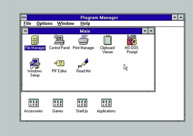
Program Manager was fairly functional, but not very intuitive. Say you want to open a text editor. Where is it? In the "Accessories" group? Or did you move it to "Office"? Or maybe you created your own custom program group long ago and forgot what it was called?
Of course, users adapted — they created desktop shortcuts, memorized file paths, learned hotkeys. However, for new users, this was a serious barrier to mastering the OS.
From enthusiast to casual user
Already in the mid-90s, Microsoft was facing a significant challenge. During that period, personal computers were no longer just for geeks and office workers. They were appearing on the desks of ordinary people, with simple teachers, schoolchildren, and even retirees learning to use them. The demographic of personal computer users was changing. However, the interface remained the same.
The OS development team understood that for Windows to become a truly mass-market system, it needed to start speaking the user's language. In other words, the tool required democratization. The new version of Windows needed to understand what the average user wanted from it.
This is how the idea of a single entry point was born — a button that one could simply click to get access to everything needed in one click.
At the same time, the development team understood that the new OS needed an interface that would simultaneously lower the entry barrier for beginners without scaring off more experienced users, while looking modern but not flashy, and working well even on weak hardware.
Psychologists and Chimpanzees
Danny Oran, a behavioral psychologist by education, joined Microsoft in 1992 with experience that bore little resemblance to that of a classic developer or designer. His qualifications were quite unique. For example, at Harvard under the guidance of one of the most influential psychologists of the 20th century — Burrhus Frederic Skinner — he completed his first project on developing a 'user interface'.
Here's how it happened.
Skinner asked Oran: 'How would you teach a chimpanzee to speak?'. Oran thought about it and decided to conduct an experiment with two chimpanzees and a homemade device — it acted as a kind of keyboard that, according to the hypothesis, was supposed to teach them English.
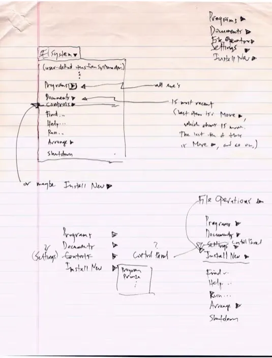
It looked like this:

'Did the chimpanzees learn to speak? No. They didn't even come close to it,' he later recounted. 'Nevertheless, it provided a lot of useful information on how to develop a computer program that even a chimpanzee could use.'
From Oran's experiment, an important principle emerged: the interface should be so intuitive that anyone can use it — even someone who has never seen a computer before.
When he started working on the Windows interface, he first decided to observe how different users interacted with the OS (at the time it was version 3.1). The results were quite… telling. For example, a Boeing engineer spent a full 20 minutes trying to simply open a text editor.
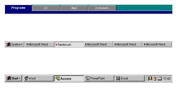
It was after these observations that the idea of a single button leading to everything a user might need was born. At first it was named «System» and placed at the top of the screen — but users ignored it, considering it too complex and technical — who knows what depths of the system it might lead to!
It was decided to rename it to «Start» (in Russian — «Пуск») and move it to the bottom left corner. This worked! One user during testing was able to complete a basic task even before they were given instructions.
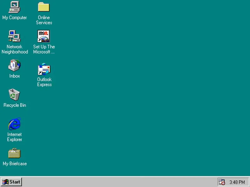
Oran also came up with the taskbar — so that users could see which programs were running. Initially these were tabs at the top of the screen, but later they were «moved down» and turned into buttons. Rumor has it that this decision was made to avoid copying Mac OS's design and prevent legal risks. But this is unconfirmed.
The left side of the screen was chosen as the «home» for this button. For right-handed people (who make up the majority), this is a sort of «rest zone» for the cursor. In addition, language features also supported this choice — after all, most of Windows' audience reads from left to right, making the bottom left corner a natural starting point. And the taskbar, which appeared alongside the Start menu, created a visual «foundation» for the interface — like a shelf where it is convenient to store tools.
However, the true genius of this solution lay not only in the button itself, but also in what it was integrated with. The new OS version introduced a fully functional taskbar. Previously, running programs would simply sit overlapping each other on the desktop, and to return to them, users had to cycle through them by minimizing and restoring windows. Now, each app got its own dedicated button on the bottom panel of the screen. The Start button stayed in place — always visible to the user.
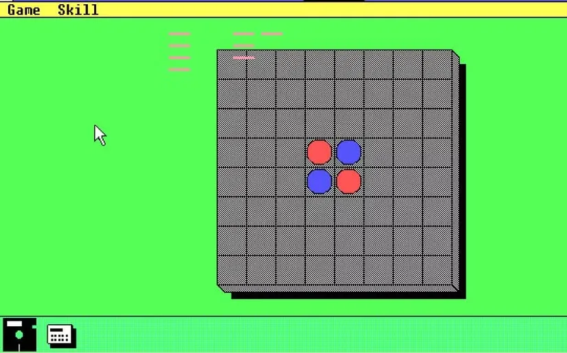
To be completely honest, a panel where users could minimize multiple running programs was present in Windows 1.0 and 2.0. Each program on this panel had an icon, which was somewhat reminiscent of the Windows 7 taskbar. This panel can be considered the predecessor of the Windows taskbar. But there was no Start menu or fully functional taskbar there.
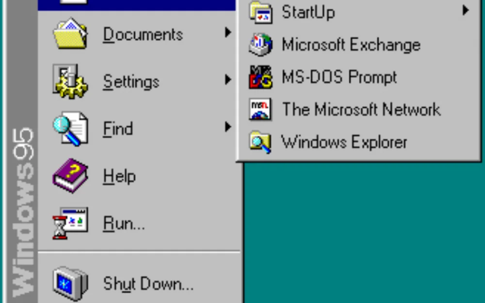
So, in Windows 95, the taskbar took on the role of a control hub — it housed the clock, volume control, network indicator, and later, icons for background processes, while the Start button became the entry point to the system's structure.
Order now reigned inside the new menu. Applications were grouped into folders, but most importantly, users could customize their layout. Magic, no less! And there was no "nailed-down" interface. Microsoft also for the first time added quick access to documents, settings, system settings, and shutdown options to the Start menu.

Yes, the success of Windows 95 and its menu is often attributed to the work of marketers. That is undeniable. But we should not forget the colossal work done by the OS interface designers.
From a basic logic standpoint, design barely changed for almost two decades after its invention. Layout, hierarchy, even the visual weight of a button — all of this became a sort of UI/UX canon.
The Glass Era
By the early 2000s, Microsoft realized that functionality is only half of success. The other half is how the user experiences the system. The gray, utilitarian interface of the 90s got the job done, but — let's be honest — it wasn't particularly easy on the eyes. Meanwhile, at the turn of the new millennium, computers were ceasing to be purely work tools, transforming into a kind of personal user space and entertainment hub. Which means it had to be beautiful and comfortable!
In 2001, with the launch of Windows XP, users saw the Start Menu in color for the first time. Blue and green gradients replaced the familiar gray monochrome. As usual, the reaction to these changes was quite polarized. Some users admired the freshness, while others found the interface "too childish". However, the new OS brought users not only a bright and attractive design, but also major architectural changes.
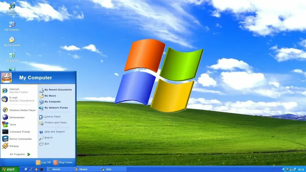
For the first time, Microsoft split the menu into two distinct zones. On the left were user applications, on the right were system items, including the control panel, help, and search. Just below was the "All Programs" button, which provided access to all installed software. This layout allowed users to quickly access everything they needed at once without digging through the hierarchy, while still retaining control.
By the way, here's an interesting fact. These days we often feel nostalgic for XP. But the key point is that XP itself was the first version where Microsoft officially gave users the right to feel nostalgic and allowed them to enable the classic Start Menu. This allowed users who found it difficult to adapt to the changes to continue using the familiar version of the interface.
By 2007, Microsoft had decided to go even further. If XP was about organization, then Vista was about atmosphere and all sorts of bells and whistles (by the way, we already told you what that led to on our blog.). The new Aero theme brought transparency, animations, glares, and the feeling of a "glass" interface. The Start menu became darker and more serious, gained semi-transparent borders, and fit into the overall aesthetic. But, as many of us remember, beauty still had to be paid for. Visual effects loaded the video cards, and on weak hardware, smooth animations turned into a slideshow.
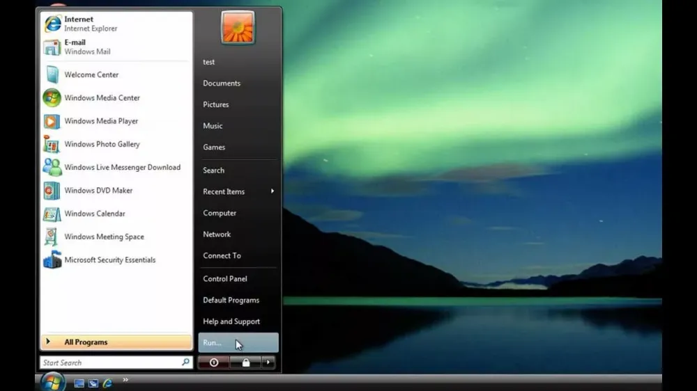
In this version of the OS, Microsoft decided to remove the text from the button altogether, replacing it with the Windows logo. This is where built-in search first appeared. Pressing the Windows key allowed you to start typing immediately — and the system instantly displayed found applications and files. This changed the interaction pattern — instead of navigating through folders, users could go straight to their query.
However, Vista had its downsides. The right panel of the Start menu turned into a continuous list of text. Visual hints for documents, control panels, or settings disappeared. Scanning it with your eyes became more difficult, and ergonomics suffered. Add to that the sidebar and other bells and whistles — and it becomes clear why many people, as they say, didn't like the updated interface.
In Windows 7, Microsoft tried to fix its mistake. The Start menu barely changed visually, but became faster, cleaner, and more predictable. The main changes went to the taskbar, which received the unofficial name "Superbar". Microsoft combined Quick Launch and buttons for running programs into a single strip. Icons became larger, transparency more refined; thumbnails of running programs appeared, along with Aero Snap features (snapping windows to edges) and Aero Shake (shaking a window minimizes all others).
The Clash of Ambitions and Habits
By 2012, the personal computer industry was undergoing a tectonic shift. Tablets were capturing the market, smartphones were changing content consumption patterns and the way people interacted with devices. Microsoft felt it was starting to lose momentum. The company made a strategic decision: Windows would become a unified ecosystem for desktops, laptops, and tablets. And to achieve this goal, it was decided to sacrifice the most recognizable interface element from the past 17 years.
The "Start" button disappeared.
Instead of the menu, the Start Screen appeared — a full-screen space with colorful "tiles". Overall, the concept looked convincing: dynamic widgets could display weather, email, news, and app statuses without launching the apps themselves. Yes, it was convenient for a touchscreen. But for a user with a mouse and keyboard, to put it mildly, it wasn't always so. Many even considered this change a real nightmare in the world of design.
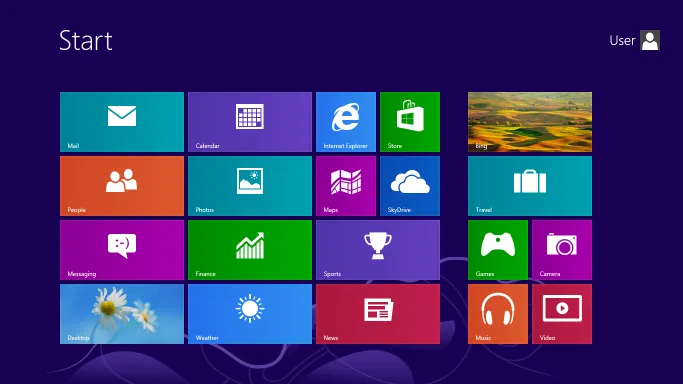
In essence, Microsoft literally hid the desktop behind the new interface. The taskbar was hidden by default, and the clock and system icons were only accessible when you moved the mouse to one of the four "hot corners" of the screen. Even turning off the computer became more difficult!
The desktop was no longer perceived as the foundation of the system, but as a separate application within the OS. This psychologically broke the workflow script for millions of users. Especially for those who were used to Windows' clear hierarchy, fast search, and predictability.
The audience didn't hold back their reaction — in the first few months after release, 1.5 million users downloaded third-party utilities like Classic Shell or Start8 to bring back the familiar menu. People were willing to install third-party software just to avoid putting up with the new interface.
Realizing the scale of the dissatisfaction, Microsoft released the 8.1 update in 2013. The button appeared again in the lower left corner. But there was a catch — pressing it didn't open the familiar menu, it just redirected the user to the same full-screen Start Screen.
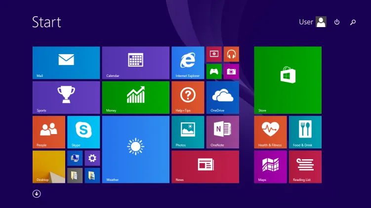
The company added quick power and search buttons, and a visual hint for scrolling down to the list of all apps appeared. These were the right steps, but they only masked a truly fundamental problem — Windows 8 tried as hard as it could to be a tablet OS, forgetting that people still used it on regular desktops.
By 2015, Microsoft finally decided to listen to users. However, instead of simply rolling back to Windows 7, the company opted for a hybrid solution.
In Windows 10, the left part of the menu stayed true to the classic layout — it held a list of frequently used programs, quick access to settings, documents, and the shutdown button. The right side remained space for tiles, which could now be freely scaled, grouped, and customized.
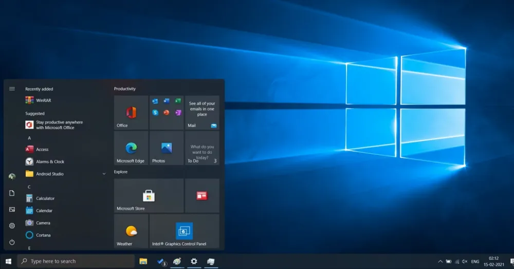
Visually, the interface became stricter and calmer — a neat color palette, translucency, no visual clutter. The result exceeded expectations. Many users who didn't want to use the awkward "eight" switched to "ten" straight from Windows 7. In spirit, the menu here reminded users of the universally beloved XP menu — a single entry point to the system, but with modern features.
By 2021, the desktop interface had reached a kind of maturity. Monitors got wider, resolutions got higher, and users became more demanding of aesthetics. And if the main task in 2015 was to bring back the Start menu, but make it modern, then by the time Windows 11 was announced, developers started thinking about how to make the familiar interface feel fresh without breaking users' habits?
So the first thing that stands out in Windows 11 is that the Start button and taskbar have moved to the center of the screen. However, this was driven by ergonomics — on wide monitors and laptops, the center is a more comfortable access zone for the eye and hand. And for touch devices, it is also a more natural point to tap.
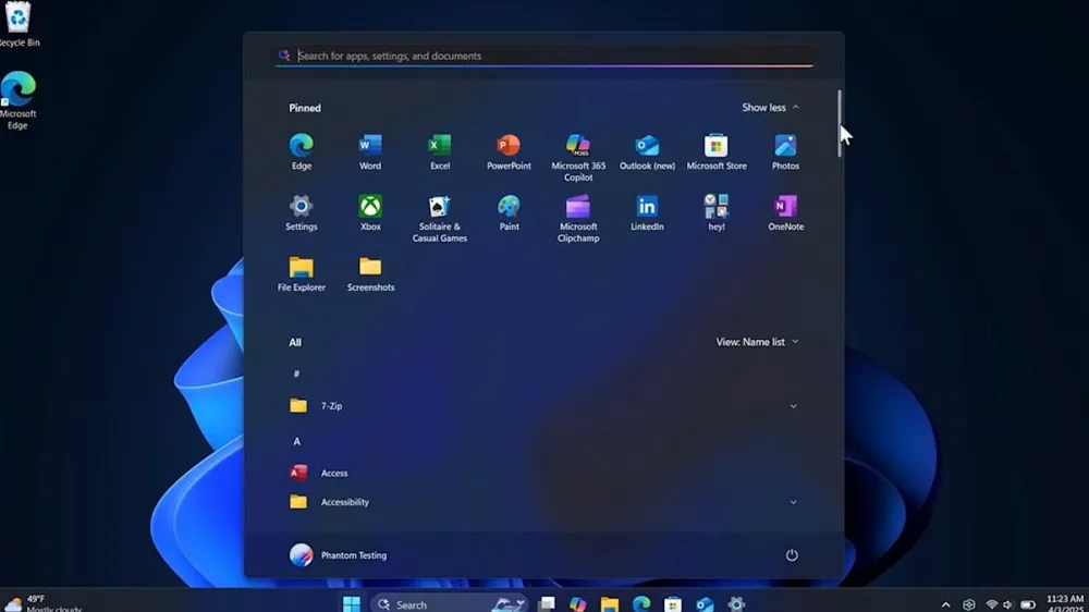
Visually, the interface has become a bit more airy — rounded corners, soft shadows, a calm color palette. Sharp borders, visual noise, and unnecessary dividers have disappeared.
Why the Start Menu is still with us
The Start Menu has survived it all. The paradigm shift from local applications to cloud services, the evolution of devices from desktops to hybrid models and touchscreens, the shift in expectations from functionality to aesthetics and back, and even its own disappearance. And its triumphant return. And it's still with us.
Danny Oran, the creator of the concept, remarked ironically in 2015: "It's a shame they're still using what I came up with. That means nothing better has emerged."
What do you think? Is it really the case that no one has come up with anything better? Or is it possible that a good interface should truly be unnoticeable to the user?

Write comment