
- Hardware
- A
Design or functionality: how we developed the look of the server bezel
Is there a place for aesthetics in server manufacturing - where reliability, cooling, and cost come first? At OpenYard, we believe so. Moreover, it is often the secondary elements like bezels that demonstrate the maturity of the product approach. Therefore, when faced with the task of developing a new component - a protective front panel or bezel, we approached it creatively.
Is there a place for aesthetics in server production — where reliability, cooling, and cost are paramount? At OpenYard, we believe: yes. Moreover, it is often the secondary elements like the bezel that demonstrate the maturity of the product approach. Therefore, when we were tasked with developing a new component – a protective front panel or bezel, we approached the matter creatively.
In this article, I will tell you how we developed the bezel design and what difficulties we encountered along the way. Spoiler: I am the head of content marketing and a true humanitarian, so I ask you to take into account that there will be little technical content but a lot of organizational creativity.
Many brands consider the bezel a secondary detail, so design typically receives little attention. The functional task of this component is to limit access to the drives installed in the server and protect them from unauthorized access. This can be achieved in various ways: one can integrate locks, latches, or even an access control system (ACS) into the panel, but that is already a quite expensive solution.
In addition to aesthetics and protection of the drive bays, the bezel directly participates in shaping the incoming airflow: all the air intake for cooling the components inside passes through it. The geometry, perforation, and thickness of the bezel affect airflow resistance, air distribution across zones, and consequently, the temperature regime and noise level of the entire system. Therefore, the requirements for the bezel are formed at the intersection of engineering, operation, and production.
The design of the bezel should not hinder airflow and affect the temperature regime of the components. From an operational standpoint, the bezel must be durable, easy to handle, and easily removable.
Manufacturing requirements include repeatability of geometry, material resistance to deformation and aging, as well as an adequate cost price in mass production.
Therefore, we approached the design development with the following inputs in mind:
we need rigid geometry. The component must fit into the server without additional structural modifications. The bezel should not affect the existing structure of the server. Refinement of details associated with the future bezel should be excluded,
we strive to ensure adequate airflow taking into account the characteristics of air flow movement. Any bend, thickening, or unsuccessful perforation at the inlet creates resistance, which can lead to an increase in temperature or an increase in fan speed and noise level,
we want the product design to align with our identity and values, as well as reflect a comprehensive approach to product development,
we expect to obtain a product that has an adequate production cost. Material, thickness, ribs of stiffness, mounting points – all of these directly affect cost price, defects, and repeatability of results in series. Why do we often talk about repeatability? Depending on the material we work with, the possibility of reproducing identical products will change.
We have dealt with the inputs. What’s next? We move on to creating mood boards and analyzing the market: looking at best practices, finding inspiration, and compiling a list of product properties that we like and that align with our vision of the finished product.
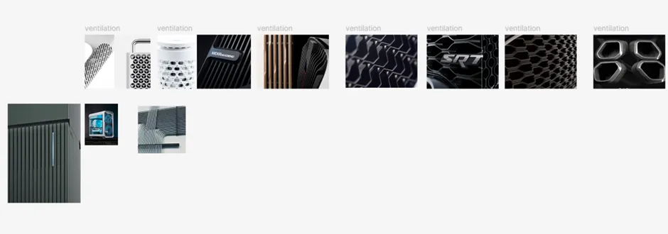
Our task here is to understand the logic of the best solutions: what techniques are repeated in mature products, which shapes and proportions are perceived as reliable, and which are seen as excessive or controversial. We look at servers of different classes and generations, compare the approaches of global vendors, and fix not only the appearance but also how the design relates to function, operation, and positioning of the product.
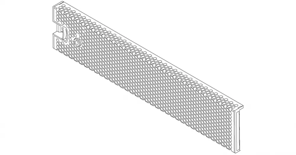
If you delve into the specifics within the brands, it becomes clear that each vendor's approach to bezels is quite consistent and reflects the overall product philosophy (this is what we strive for as well). For Lenovo, for example, the bezel is a utilitarian element. There are minimal decorative solutions, calm geometry, even fine perforation, and extremely restrained branding. Such a bezel is purely functional – it does not carry any information about the brand but serves the purpose of protecting the disks. This approach emphasizes the priority of engineering function over visual identification and makes the bezel a maximally neutral element of the system.
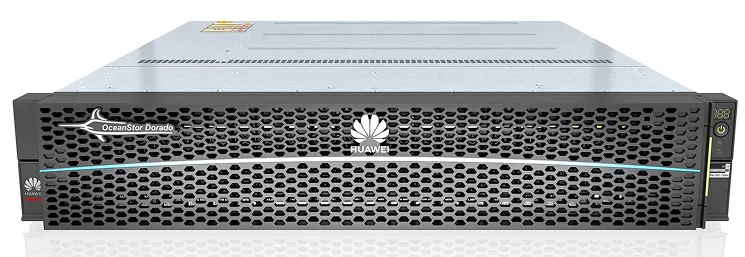
Huawei adheres to a similar minimalist approach but places greater emphasis on brand identification. The bezels look concise – the design uses the already familiar perforation, and the logo becomes a visual focal point of the panel. This approach well demonstrates the balance between engineering requirements and the necessity of being recognizable within the corporate infrastructure. As a result, the bezel becomes not just a functional detail but a neat brand carrier that does not conflict with engineering requirements.
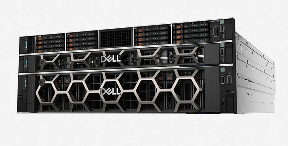
Dell, on the contrary, uses the bezel as an element of the visual language of the lineup. The characteristic large honeycomb structure and accent logo make the front panel recognizable at first glance. At the same time, the functional part is not lost behind the external expressiveness: the grid structure ensures the necessary airflow, and the design remains easy to maintain. This example shows that even in the strict server segment, visual expressiveness is possible if it is subordinate to functional logic.
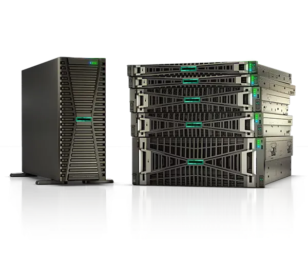
At HPE, the evolution of bezels illustrates a general shift from visually expressive, "decorative" solutions to neutral and engineering-precise ones. In earlier generations of ProLiant servers, the front panel was often built around large honeycombs or pronounced geometric patterns that made the server noticeable in the rack and emphasized its brand affiliation. This approach worked for recognition, but over time it became perceived as excessive—especially in environments where density and cooling are key.
In new models, HPE gradually moves away from large cells in favor of fine, almost "noisy" perforation made up of randomly placed holes. Visually, such a bezel appears calmer and more technological; it breaks up the front plane less and better integrates with the dense layout of disks and indicators. At the same time, the fine mesh provides greater flexibility in terms of airflow: it is easier to achieve the desired open area, manage the rigidity of the panel, and avoid resonances characteristic of large geometric patterns. This shift reflects an overall maturity in approach: from demonstrative design to visually calm, engineering-precise solutions.
In developing our own design concept, we approached it with the understanding that relying on existing brand patterns would not be possible: they simply did not exist in the brand book, as there was no need for them. This meant that the bezel could not be laid over an existing visual language—it needed to be formed from scratch. The object itself already imposed an important limitation: the bezel implies a grid structure directly related to the movement of air flows. Therefore, the pattern must become part of our identity with an emphasis on technological requirements.
The starting point was the OpenYard logo as an already recognizable brand element. We began by dissecting it: breaking down the sign into its components, analyzing geometry, radii, proportions, and the nature of the lines. The goal was not to directly quote the logo but to extract basic shapes from it that could be used. As a result, we identified two key elements—simple and universal—to serve as the foundation for the pattern without a direct reference to the logo.

With these elements, we began to experiment: scaling, rotating, repeating, and checking how they behave in the grid and how they come together into a rhythmic structure. It was important to achieve a balance between recognizability and neutrality – so that the pattern was read as part of the brand. Thus, the pattern became a logical continuation of the engineering function of the bezel, embedded in its geometry.
Then we experimented with lines, patterns, and volumes. One of the concepts did not come to life but we still really like it. And it received a great response from engineers, as many saw something like a Sith dreadnought from the "Star Wars" franchise in it.
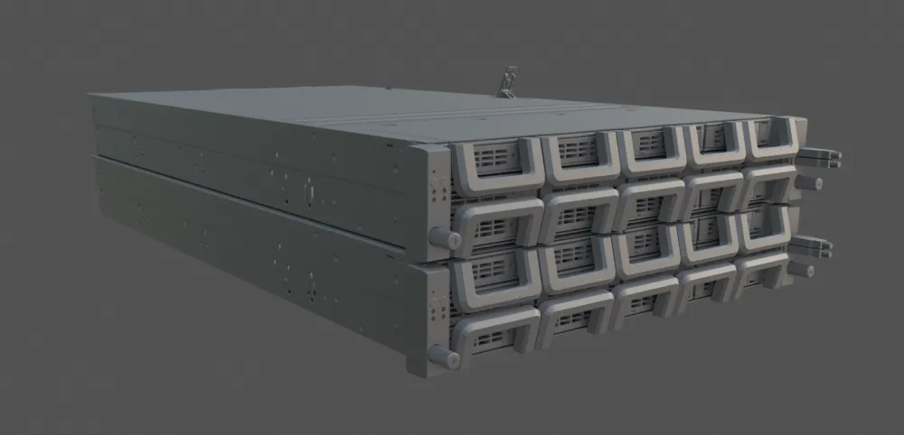
Further experiments were dedicated to finding a form of the pattern that works both as a visual identifier and as a structural grid for the bezel. We tried different ways of assembling the basic elements: increasing the scale of the cells, breaking them into smaller ones, changing the density and rhythm of repetition. Some of the experiments were deliberately graphic with enlarged shapes that look good on a flat surface but were quickly discarded due to poor applicability to real perforation and airflow limitations.
At the same time, we tested more utilitarian options where the pattern is as close as possible to the classic grid but retains the brand's character through the shape of the rounded edges and proportions. An important factor here was the behavior of the pattern at the scale of the entire bezel: how it reads from a distance, whether it visually breaks the panel, and whether it turns into visual noise with dense placement of holes. Such iterations helped find a balance between recognizability and the calmness necessary for server equipment.
A separate direction became experiments with directed structures, where the pattern interacts with the vertical or horizontal rhythm of the body. We tested how elements "lead" the gaze, emphasize the geometry of the front panel, and work alongside the logo, indicators, and service areas. These samples allowed us to understand which solutions could be scaled across the entire range, and which remain interesting but too specific for practical application.



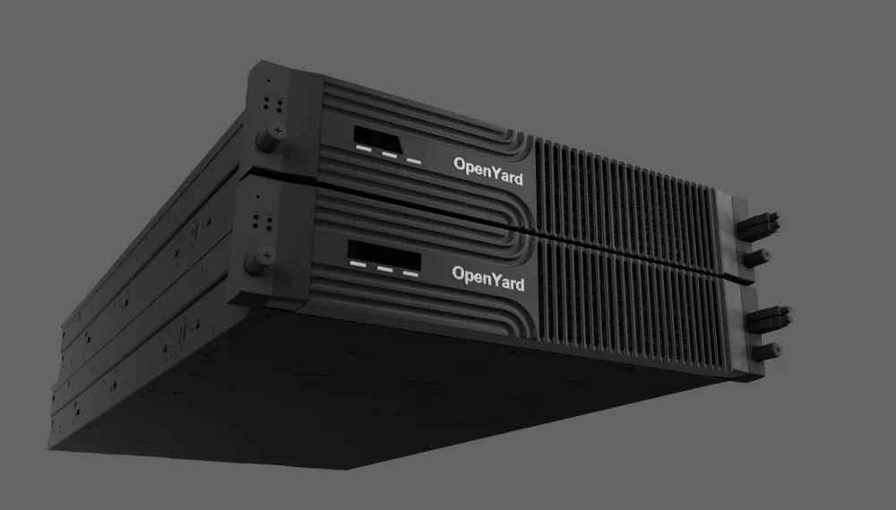
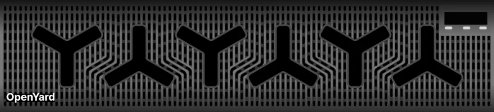
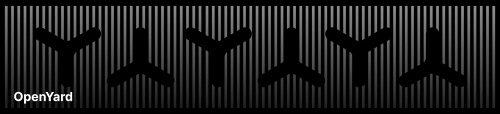
As a result, we formed a pattern that organically connects the visual identity of the brand and the functional nature of the bezel. It is based on shapes extracted from the logo but does not directly quote it. Instead, it uses familiar geometry as a building block of the grid. Due to its repetitiveness and rhythm, the pattern easily scales across the entire front surface and is perceived not as graphics but as part of the structure, logically integrated into the gridded structure of the bezel. Furthermore, the most creative saw fan blades here. And since the bezel does not interfere with the airflow inside the device, this association aptly supports the overall design concept.
Separately, we ensured that the final solution coexists correctly with functional elements. The pattern does not draw attention to itself and does not conflict with existing elements; rather, it helps to unify the front panel. As a result, the bezel ceased to be a neutral detail and did not turn into a decorative object: it became a recognizable, functional, and durable element of the OpenYard product system.
The next major phase of work that begins after the design stage is construction. At the concept level, the bezel exists as a flat solution: pattern, proportions, and visual logic of the front plane. At this point, the design answers the question "how should it look and be perceived," but not yet the question "how will it be assembled and how will it work." The transition from sketch to three-dimensional element is one of the most complex stages, where each decision begins to confront physics, tolerances, and manufacturing limitations.
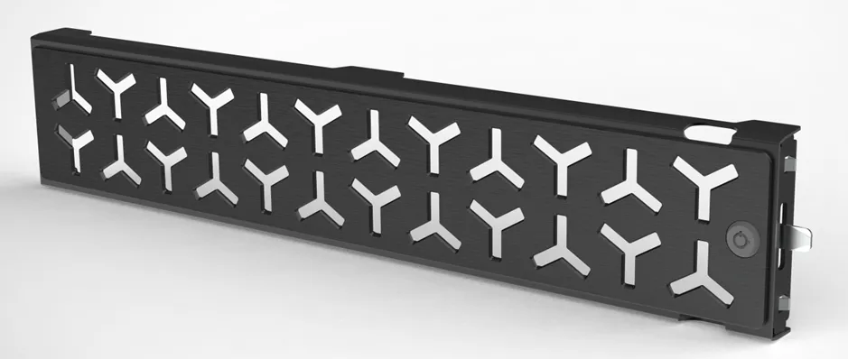
For the concept to turn into a 3D part, a significant amount of work from the engineers is required: recalculating thicknesses, rigidity ribs, fastenings, junction zones with the case and service elements. The behavior of the material, manufacturing technology, assembly and disassembly, as well as how the bezel will behave under load and over time must be taken into account. At this stage, the design inevitably gets refined and adapted as part of collaborative work, aimed at preserving the original idea while making it feasible, reliable, and suitable for mass production.
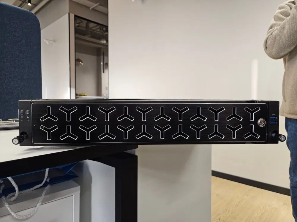
The finished product became the point where the concept ceased to be graphics and finally turned into an engineering product. In real materials, the pattern reads more calmly and strictly than in renders: it does not dominate but works as a structural part of the front panel. Due to the metallic execution, the depth of the cutouts, and the play of light, the pattern assembles into a cohesive surface that looks technological and does not create a sense of decoration for effect. The bezel is perceived as a full-fledged element of the construction.
It is also important that all key functional hypotheses were confirmed in the physical product. The pattern does not interfere with air intake, does not create visual noise, and does not conflict with service elements – ports, indicators, and locks. The panel itself looks equally confident both upon close examination and when standing among other equipment. This is exactly the effect we aimed for during the market analysis and best practices phase.
As a result, the bezel has become not just the face of a specific server but a carrier of a new visual code that can be scaled further – to other models and form factors. It is not tied to a single product and does not become outdated along with a specific configuration, but works as part of a long-term product language. For us, this has become the main marker of success: the design does not shout about itself but makes the product recognizable.
Moreover, we ended up with a ready-made pattern that became part of the corporate brand book and can be used in the branding of other components, casings, or even software on board the server. Thus, one small project became part of a large product story that unfolds right before our eyes.
At this stage, we received a working prototype – the product. But for server equipment, this is only the middle of the journey. Before the bezel becomes part of a serial product and starts being shipped to customers, it must undergo a full cycle of tests in conditions as close to operation as possible.
Ahead are thermal and load tests. We will check how the bezel behaves as part of the server under various load scenarios, temperature regimes, and noise levels. Special attention is given to the behavior of the panel during prolonged operation: resistance to vibrations, temperature fluctuations, and mechanical impacts. These tests allow us to identify non-obvious effects that cannot be predicted at the design stage and make timely adjustments to the design.
After this, there will be checks related to serial production and operation: repeatability of geometry, quality stability, ease of assembly and maintenance. Only after passing all these stages can the bezel become part of the product line and go beyond the prototype. We plan to tell about each of these steps – from testing to final integration into the product – separately to show how design in server equipment transforms into a proven and reliable engineering solution. This project has shown us that even in server equipment, design ceases to be decoration and becomes part of engineering thinking.



![From Virtual Hands to AI for Survivalists: Curious Open Agent OSes [and One Hardware Project]](https://cdn.tekkix.com/imgs/2026/05/habrcom/big/ce0b1057616faed51cd8b9f3b2b9.webp)
Write comment